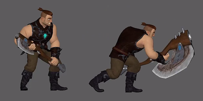
5 Acting Tips for Animators with Examples

Acting for animation is an important but a very tough step for an animator to take. The choices one makes for the story, make or break his/her animation piece. There is no denying that doing animation well is very important; no one wants to see a badly moving character with jerks and knee pops but if one makes cliched choices, misses the beat or goes for an acting choice that lacks interest then no matter how good the animation is, audience just won’t pay attention. As a storytelling artist, this would be a nightmare.
Acting for animation is also a very broad subject. In this blog post, I would, therefore, like to present top five acting tips shared by our AnimSchool instructors. I hope that these will help you make better acting choices for your animations may it be a pantomime or a dialogue piece.

1. Keep It Very Very Simple

One of the things new animators tend to do is to over-complicate things. Some do it because they think:
a) it will make their animation more interesting;
b) it will help them flaunt their animation skills and
c) doing a simple motion would not help them impress their recruiters.
They want to do something different and thus often make complicated choices. As our AnimSchool instructor points out, simplicity sells the story most, not the over-complicated steps.

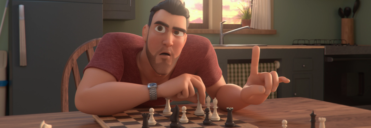
Following is the work of an AnimSchool student that explains this point well.


2. The Personality of A Character Drives Acting Choices

Before you start shooting reference for your character, build up a personality for him/her first.

  • Who is the character? 
  • What is the goal? 
  • How is he/she feeling at the moment? 
  • What is the history of this character? etc.

 After you figure it out, you need to start making your acting choices on the basis of that personality.

It is important to understand that it should not be “YOU” acting as “YOU” in front of the camera. It should be the character doing what he/she is supposed to be doing at that particular point.

Our AnimSchool instructor, Garrett Shikuma describes this point best with an example in the following video.

Here is an AnimSchool student who demonstrates this point in this following video.


3. Don’t Make A Generic Character

If you are making a dialogue shot, chances are that it is only going to be 10-15 seconds long. In these few seconds, you will have to define not only a character but also the situation the character is in, to the audience in the best possible way. If you truly want to stand out from the other animators, it is very important to flesh out the story element and the scene before shooting reference. One of the best ways to do so is to think not just about that scene but also make up a story outside the scene; maybe something has happened before the shot and that’s why the character is acting in a certain way or something is about to happen. This will help you make better acting choices as the character won’t be just going through motions but would have intent behind every action and that will help you get the best possible acting choices for your scene.
Our animSchool instructor, Terence Bannon describes this point eloquently in the following video.

This whole idea is encapsulated very well in the following work of AnimSchool graduate.


4. Know Your Rig Well

Before shooting reference, it is important that you understand the limitations and strengths of the character rigs you are going to use. Not every character has humanoid proportions. Sometimes there are characters with huge chest but very small hips and legs. There might be limitations over how much you can control face of the rig. So, try to understand the weaknesses and strengths of the rigs before shooting references. Even if you shoot a brilliant acting reference, it would be of no use if you fail to translate it properly onto your rig. Our AnimSchool instructor. Thom Roberts explains this point in the video below.

Here is the example of such reference shooting by one of our students.


5. Be Visual

As our AnimSchool instructor points out below, animators are visual people. We like to understand story through visuals so don’t be coy; be as much visual as possible. Remember, the animation shot is only a few seconds long so use props, costumes, stage your character as much as possible. From the first frame, it should be apparent as to what is going on. Don’t hold back!

Following video of the AnimSchool student illustrates this point very well.

I hope this blog helps you with your next animation project. Keep animating!

For more such lectures and tips, apply for AnimSchool’s online 3D animation classes at www.animschool.com

Exaggerating To Your Advantage

What makes animation fun is bringing things to life. Animators often study reference video to get inspiration from real movement, but sometimes what we see in real life doesn’t translate well to animated shots. This is where exaggeration plays a major role; we caricature the motion to stylize the visual result. Without exaggeration an animation can feel boring or lifeless.


Animation gives us the possibility to explore movements that don’t necessarily obey the exact rules of real-life physics. With animation we have the chance to take the foundation of real-life physics to a higher level with exaggeration, resulting in something much more interesting and fun to watch.


Real-life movement and poses and acting is already interesting, but how much more entertaining it can be to put your audience into an alternate reality, where the rules of physics and nature are bent and stylized a bit – to make something truly unique.

How would you enjoy watching a classic Bugs Bunny short but with realistic, motion-captured movements?  It wouldn’t be as enjoyable would it?


It is easy to feel limited by the rig you are working with, but you shouldn’t be scared of pushing it beyond its limits. Although rigs can be broken, it is likely that when played back at full speed, what looked weird for one frame of your shot may be unnoticeable. Testing the rig you have and finding how you can work around its limitations is always useful. Remember to break the rig to your advantage!

One way to exaggerate your animations is through your poses. Animated poses aren’t just a reflection of real life, they are staged for the camera or audience’s view to more fully embody the moment and action, carefully crafted to tell the story and convey the emotion the best way possible. A carefully crafted exaggerated pose creates more appeal — it’s more interesting to look at. There may be times when you match the pose exactly as you see it in video reference and that may work well, but you will want to find places and parts of the body you can push to make the pose work better. A great way to do this is first creating the pose you see on your reference and once you are satisfied, go back to it and figure out how you can make it more interesting. Can you simplify the line of action running through the body? Can you create a stronger contrast with other storytelling poses? Is this the best, most entertaining way to make this pose?

The other major opportunity is exaggerating timing. Animated movements often have simplified transitions, sped up to
emphasize the poses before and after. That makes an animation look
“snappy”.

The timing in your video reference should only be used as a guide and most often you want to push it for maximum effect. Imitating reality can lead to very floaty and dull animations.

Depending on the context, exaggeration can be in small or large amounts. If the production and designs are more realistic, exaggeration should be minimal. More stylized designs lend themselves to more stylized movement and posing.  It is important to keep in mind that a subtle exaggeration in timing or spacing may be just what your animation needs. Don’t forget that you often want to feel the exaggeration more than you want to see it!

Develop Your Skills As An Animator!

Mastering the art of animation can be truly hard. It can take years of hard work and dedication to get you to where you want to be, and as technology grows and develops, there are always new things to be learned in the animation field. However, following the right workflows and techniques can help you develop your skills as an animator faster than you might think.


It’s all in the basics!

When you start learning animation, you might want to tackle a walk cycle or a complex acting shot right away. Still, you should start out simple and try not to take on an animated shot above your skill level, as it will probably frustrate you when you should be having fun! 

Instead, you should start with a simple ball bounce. This is the first exercise any animator must master. Once you feel confident, you can move on to animating a ball bounce across the screen and eventually incorporating squash and stretch, adding more personality to the ball. Soon you will see that with each new exercise you tackle, your skill level will grow and you will have incorporated new animation principles to the mix. Remember: working in small chunks will guarantee that each technique is mastered before you can move on!

Get Inspired

One of the best ways to improve your animation skills is to find out what inspires you as an animator. Watching your favorite animated movie is a great way to study how the animator incorporated the principles, so you can then try to implement those techniques into your own shot. Keep in mind: watching these amazingly-executed animations should make you want to jump onto the computer and animate, and not make you feel discouraged by their level of complexity. Use movies to inspire you to get to that level! 

Get Your Body Mechanics Working

Once you know the principles, you can start learning about body mechanics. Knowing how a human should move is they key to a great acting shot. The best way to start is by animating a simple walk cycle. Once you have nailed that down, you can try to animate a character walking and coming to a stop. Take each exercise one step at a time and keep them short, from three to four seconds. Each shot will be a bit more difficult than the last, but as your skill level grows, you’ll be amazed at how much you’ve progressed.


Act It Out

 
Once you feel ready to take on acting and dialogue shots, on of the most useful things is to study live action films. You can take a scene in a movie and analyze the actor’s movements. This is a great exercise to help you incorporate small nuances found in great acting. 

The More Feedback The Better

Working on your shot for a long time can make you skip little mistakes. In other words, if you are the only one looking at your animation, it can get very hard to give yourself feedback and notes. Asking for someone to look at your shot, even if that person doesn’t have animation knowledge, will help you see if something isn’t looking right. Remember not to take it personally if someone has a different idea for your shot– sharing your work is a great way to improve! 

Don’t Forget!

Learning animation is a never-ending process, but learning it in small chunks and having the right mindset will ensure that your animation skills grow faster. It’s not about the length of your shots, but rather how many shots you get completed and how much you push yourself with each one!

Come join us at www.animschool.com 

5 Books Every Animator Should Have

There are a large variety of animation books for different uses out there, such as 2D animation, stop motion, 3D and much more. Still, there are 5 books that any aspiring and professional animator should have.


1- The Animator’s Survival Kit by Richard Williams

When it comes to the principles of animation and body mechanics, this book starts you off on the right track as it thoroughly covers the basics of spacing, timing, weight, anticipation, walks, dialogue and much more.

Richard Williams is best known as the Director of Animation and designer of the new characters for Who Framed Roger Rabbit, for which he won two Academy Awards.

This book will provide you with the best training while learning to be an animator.


2. The Illusion of Life by Frank Thomas and Ollie Johnston

Considered by many to be the animation Bible, this book gives us lessons learned from the early Disney films, providing the theory behind every principle of animation. Frank Thomas and Ollie Johnston worked at Disney since its earliest days, and wrote this book to take the reader through their experiences as they discovered and researched the best methods of animation.

3. Cartoon Animation by Preston Blair

This book focuses on five key areas; character movement, character development, animation, dialogue, and camera sound. It comes in handy for developing a cartoon character, animating dialogue with action and creating dynamic movement. Preston Blair worked in big studios such as Disney and Hanna Barbera. His book is also considered to be great for animal animation, since it shows in detail a lot of examples of animating different types of cartoon animals.

4. Draw the Looney Tunes: The Warner Bros. Character Design Manual

This animation manual was created during the Golden Era of Animation, and it focuses mostly on traditional animation and drawing. Although it doesn’t dive into the principles of animation, it does provide great insights and tips on how to pose characters and how to break down live action photos into readable animation poses.

5. Acting for Animators by Ed Hooks

Any animator knows that storytelling is extremely important when it comes to animating a shot. This book is a toolbox to discover and create your character. Ed Hooks, industry-known acting instructor for animators, gives the reader a taste of acting theory as well as exercises and examples to take your animation to the next level.

Come join us at www.animschool.com 

Milestones in the Animation Industry

Animation has come a long way since its beginnings, and it’s always interesting to see how technology has changed the industry throughout the years.

These are some of the years that marked a milestone in the animation field.

1908

“Fantasmagorie” becomes the first film using hand-drawn animation. It was animated by Emile Cohl, and consisted of 700 drawings, each exposed twice, leading to a running time of almost two minutes.

1919


Felix the Cat is introduced and it is considered to be the first animated movie star. Aside from the animated shorts, Felix starred in a comic strip drawn by Pat Sullivan and Otto Messmer, and was later redesigned by Joe Oriolo as the cartoon began airing on American TV in 1953.

1928

Walt Disney Studios releases “Steamboat Willie”, the first cartoon with sound printed on the film. Although it received some criticism, the film also got wide critical acclaim for introducing one of the world’s most popular cartoon, as well as technical innovation to the industry.

1930


Warner Brothers Cartoons is founded, the in-house division of Warner Bros Pictures during the Golden Age of American animation. It was responsible for the Looney Tunes and Merrie Melodies, which featured characters such as Speedy Gonzalez, Sylvester and Tweety and Daffy Duck among many others.

1937 

Snow White and the Seven Dwarfs is released by Walt Disney Studios, making it the first animated feature to use hand-drawn animation. It was both a critical and commercial success, earning $8 million in its initial international release, assuming the record of highest-grossing sound film at the time.


1960

The Flintstones become the first animated series on prime-time television. Its popularity was based on the juxtaposition of modern everyday concerns with the Stone Age setting. The series was the most financially successful network animated franchise for three decades.

1984


The Graphics Group releases “The Adventures of Andre & Wally B”, the first fully CGI-animated short film. The animation done by John Lasseter, was groundbreaking by the standards of the time and helped spark the film industry’s interest in computer animation.

1987 

Matt Groening creates “The Simpsons”, the longest-running American animated sitcom. Groening created a dysfunctional family, naming the characters after his own family, substituting Bart for his own name. After a three-season run, it became a half-hour prime time show.

1995

Toy Story is released, becoming the first fully computer-animated feature film. Pixar, which produced short animated films to promote their computers, was approached by Disney to produce a computer-animated feature after the success of their short film Tin Toy (1988). The studio, then consisting of a relatively small number of employees, produced the film under minor financial constraints but became the highest-grossing film upon its release earning over $373 million worldwide.

2001

Monsters, Inc. is released, reaching over $100 million in only 9 days, faster than any animated film in history. It took home two Academy Awards for Best Song and Significant Advanced in the Field of Motion Picture Rendering.

2014

Big Hero 6 becomes the first Disney animated film to feature Marvel Comics characters. Reaching over $657 million worldwide, it became the highest-grossing animated film of 2014 and won an Academy Award for Best Animated Feature.

2016

Finding Dory premieres, grossing over $1 billion worldwide and becoming the first Pixar film to cross this mark since 2010’s Toy Story 3. The film set numerous records, including the highest-grossing animated film opening of all time in North America.

Cyril Jedor – Importance of Light

In AnimSchool’s Art Class, Concept Artist Cyril Jedor discusses the importance of light in storytelling.

To know more about our online animation programs, visit www.animschool.com

Interview- Sylwia Bomba

Hailing from the artistic city of Florance, Italy, Sylwia Bomba is a young and talented artist. She has been involved in several projects at Pixar and Disney in the past years. She was also a drawing and painting instructor at AnimSchool where she taught students how to draw and paint digitally. Recently we got a chance to interview her about her art and any advice she had for artists around the world.

Sylwia, tell us about yourself and your journey to becoming an artist.

First of all, I would like to thank you for having me! It’s a pleasure.
I have been drawing since I was a kid and I never stopped. I’ve always loved being surrounded by my papers and pencils. I still remember the day when I told my parents about my dream: I was about 5-6 years old. They didn’t take my decision seriously but I was a very stubborn kid and I kept insisting. My dad saw my determination and decided to support me with all his heart. Shortly after that, he became my first drawing teacher – the most meticulous, diligent and patient one.  I’ve learned from him that being satisfied with our work while having a big ego kills our ambition and turns it into blind pride.  He wanted me to push myself in my work asking me to work harder all the time. This is how my adventure with art began. I would be sketching after school, at school, on holidays, on summer breaks…I was growing up with a pencil in my hand.
At the age of 15, I moved to Italy and started studying in Italian High School. Being in a country with such long history of art inspired me even more. I wanted to learn everything about art but it was hard in the beginning: I had to learn a totally new language. It was a struggle to find myself an accepted place after being a stranger in the society. But I was determined that even if I had to lose many things in my life – I would do so because, for me, my passion for arts defines my whole life. So I kept going on.
The most important thing we all need to remember is to never lose our faith. There will always be something to complain about, there will always be someone who won’t like what we do – but we need to pursue it as hard as we can! Dealing with setbacks and failures, using them as a learning opportunity to push ourselves more, learn more and discover more is the only way to move forward and be successful.

Looking at your portfolio I cannot help but feel the emotions you are able to pour in each of your paintings. The portraits are full of personalities and emotions. How are you able to do that? How do you make portraits seem relatable in this age of photography and selfies?

Thank you very much! I like drawing and painting portraits because through portraits I can show my deep emotions without using any words. When I moved to Italy at the age of 15 – I was not familiar with the Italian language and was finding it hard to communicate with people. Art helped me then to express myself. I started observing the world around me with more attention and accuracy. I observed that when we stop using words – we see things differently; we notice with great intensity just how majestic our world truly is. Tones and colors change immediately: we pay attention to any little expression we see, so much so that we can almost feel it on our skin. The same thing happens when we watch silent movies. They have their own taste and charm which we don’t see in modern movies.
Time has changed but people can’t change that much. We still are emotional beings and we feed our curiosity with interesting stories. We love to see what someone is doing, what he is eating and how he is changing his life. People in the past used paintings as an instrument to tell us their stories. A good painting should tell you a story or arouse emotions in your heart and bring life to your memories. In fact, Art is not what you see, but what you make others see.

What I enjoy the most when I view your portfolio and your blog is the variety of media you employ to paint your paintings. There are oil paintings on canvases and then digital paintings as well. How do you manage to work with both media?  

How do I manage to work with both media?  I enjoy it! The more techniques we try, the more flexible we will be in digital Arts. Through computer we imitate coal brushes, oils, canvases – why shouldn’t we just learn how they work in real life – to improve the use of a digital imitation of them?

What’s the best and worst aspect of both media and do you miss ctrl+z when you paint on canvas?

Of course, I miss my ctrl+z on canvas! Maybe that’s why I find the oil painting more challenging. You need to focus on your colors. You can’t just pick them up. You also can’t just make a selection of an arm and move it. But using computers, you can’t feel the unique smell of the turpentine, you can’t touch the canvas and feel how soft is the brush. Computers save your time but take from you the satisfaction of touching your art piece. Moreover, using traditional media – you always have one original painting. You can sell many copies of your art – but you still have that original.

A video posted by Sylwia Bomba (@sylwior) on

I am always impressed by the lighting and colors of your art pieces. It is a very difficult thing to do. We at AnimSchool also offer a 3D lighting course. What advice would you like to give to the students of that class which would help them get a better sense of lighting and colors in their work as well.

A painting demo by Sylwia in AnimSchool class 

Thank you very much! The greatest teacher is “observation”. The more time you spend observing the world around you, the more you see. Studying photography is also a good method to understand the composition and the lighting of a scene. Traveling everywhere with your camera is very helpful. It’s good to create your own folder with your inspiring pictures of different lighting and then using them into your scenes. You can also choose a landscape you want to photograph – but before taking a photo think about the lighting. Which emotion does it evoke? Representing one landscape in different lights during a day helps us to understand how many stories we can tell through the lighting.

You taught an art class before at AnimSchool. How was that experience?

It was and still is an unforgettable experience. Art isn’t about getting the right answer but is also about getting the right question. The questions taught me more than you can even imagine. I’ve learned a lot from AnimSchool students, their questions taught me to look beyond books and seek more information. I love teaching but I love it more when students interact with me during the class and show me their work and express their different views. It’s an extremely inspiring part of teaching.
 I’ve seen so many AnimSchool graduates achieving great successes on their career path, working for big studios. It’s an honor to be a drawing instructor for AnimSchool and meet so many great people. I’m thankful for it!

I see that you have also animated few shots. In your experience, how does knowing fine arts helped you in animation?


I’m not proud of this short animation – it was my first 3D exercise Animation I’ve done.  But thank you for mentioning about it. While learning Fine Arts you need to feel the flow of the pose, you need to understand deeply the anatomy and how it works. You learn the mechanics of the muscles and most importantly your aesthetic eye perceives the world differently. Our perception expands horizons of our vision and allows us to put a higher meaning and value into our work. The more styles we learn, the more biographies we read, the faster we find our own style and vision.

Malcolm Animation – Sylwia Bomba from Wanderer Bomba on Vimeo.

If you have to advise someone who is just starting in the field of painting, what would your advice be? What is the most important principle/rule that they have to nail before moving ahead?

Many people give up quickly because they can’t see the results of their hard work or they compare themselves to others or more experienced artists. In the process of working on your dreams, you are going to incur a lot of failure and hardships. It’s necessary to take control of your fear, be aware of your value and focus on your dream. If you will work hard, all mistakes and failures will be just investments into your progress.
Follow your idols, read biographies of old masters, learn different styles and techniques. Sometimes to understand our purpose better, we need to study other people’s life. First steps are always the most difficult but remember all of them lead you toward your future success.
The humility of an artist has a meaningful value. Nowadays is very rare to meet young and humble artists. Being humble doesn’t mean thinking you are bad at drawing. It means you know your value; you know who you are but you are always ready to learn more from others.

Thank you, Sylwia for the interview.

Sylwia’s blog’s link: http://wandererbomba.blogspot.com/

Graduate Spotlight – Jane Wang

Today, we’d like you to meet Jane Wang, a recent graduate from AnimSchool’s Character Program!

Hi Jane! To start off, can you tell us a little bit about yourself and your background? At what stage in your life did you decide you wanted to get into the 3D animation industry?

I grew up constantly doodling and being passionate about art, but didn’t believe that art was something you could really pursue. This led to me studying mechanical engineering and feeling really dissatisfied in school. In my third year of college, I had my first real world exposure to 3D modeling when I worked at a virtual simulation lab. It blew my mind that you could actually have a job making models. I’ll always remember the first model I ever made for that lab; it was a simple shelf that took me way too long to figure out because I had no idea how to actually make 3D models. After reading and watching a lot of tutorials, I fell in love with 3D modeling and thought it was the perfect balance of something technical and artistic. When I graduated, I had a choice whether to stay in the Washington, DC area and work as an engineer, or go to California and work for a fine artist. I still had a lot of flexibility, so I chose to take a chance and pursue art. I decided that AnimSchool was where I could get the most out of learning 3D modeling and really hone my skills.

What is your favorite thing about being a 3D artist?

My favorite thing about being a 3D artist is the ability to make even the most fanciful designs look and feel real. I love how every time I work on something new, I get to research and gather references to understand what things are supposed to look like and how things work. It’s like solving a puzzle and is a constant learning process. I especially enjoy environmental modeling because there are so many elements and small details that all have a part to play. Every object is important and needs care and attention to bring a scene to life.

What sort of things do you like to do when you’re not behind a computer screen?

I’m a very active person and love running, hiking, and practicing Aikido. I also enjoy machining and fabrication, eating good food, and travelling. I always feel like there are way too many things I want to do and not enough time to do them all. But right now, I’m really focused on getting good at 3D modeling, so I spend most of my time in front of a computer.

Who or what are the major influences behind your work?

My husband is my main inspiration with his unwavering love and support. My friends and family have also been extremely encouraging. The incredible teachers at AnimSchool motivated me to do my best. Juan Pablo Chen and Brien Hindman were especially influential in making me a better modeler with their encouragement and exceptional attention to detail. The many friendly and talented people in the community also make me excited and passionate about being an artist.

Could you tell us what you’re currently working on?

Aside from working on my portfolio and reel, I’m currently part of a few animation projects that I joined through Artella. The teams are filled with incredible people and I feel really lucky to have the opportunity to work with them. There’s The Book of Mojo (https://www.bookofmojo.com), Mal & Ava (https://malandava.tumblr.com), and Pure (http://thisispure.com/). Keep an eye out for them in the future!

How do you feel you have grown as a 3D Artist since starting AnimSchool?

I have grown exponentially since first starting AnimSchool. When I first started, I felt pretty overwhelmed with how much I had to learn. Basic models felt really challenging to make, and I had to really go through and soak in a lot of information. I think that having teachers I could interact with really made a huge difference. I was able to get a lot of feedback, so I worked a lot harder to improve myself. I’m really happy that I studied at AnimSchool and feel that I’ve benefited enormously from the experience.

You can see more of Jane’s amazing work at her website (https://www.jwangart.com) as well as her artstation (https://www.artstation.com/artist/jwang). 


And be sure to check out her Demo Reel below:

To come and learn at one of the best online animation schools, please visit animschool.com

Student Project Spotlight – Yvonne Zacharias

Today, we’d like to show you a beautiful 3D environment model by Yvonne Zacharias, which was created during her Environmental Modeling class at AnimSchool over the summer. Yvonne was kind enough to talk to us about the process she went through and thoughts while working on this project.

What was it about this particular concept art from The Lorax that made you chose to turn it into a 3D model for your Environmental Modeling class? What part(s) were you most excited to model?

When I first saw Clement Griselain’s design of the Oncler house, I just fell in love with it and I knew, this was the concept I was going to turn into a 3D model for my class. The building is so quirky, so whimsical and has got so much character that if it could talk, it would tell us the most unusual and hilarious stories you’ve ever heard. I also love that you can already tell what kind of eccentric character would live in a building like that, it feels, as if the house is an extension of what the character living in it is like. For me that’s what makes an amazing environment – when I look at it I get hungry to see what’s inside and who’s crazy enough to inhabit a place like that. The perfect mix of cartoony madness and crooked lines with everything being bend slightly and no two objects being the same.
I guess, I was most excited about modeling the writing that was carved into the wood and the outhouse with the heart shape cut out between the wooden slats. But also, all the different little bits and bobs like the bath tub or the crooked steps to the back porch super excited me. I just super wanted to see this fantastic concept coming to life in 3D.

Can you tell us about the process you went through in creating this environment?

A ) I started off looking for more reference pictures and I ended up finding a great concept picture of the front and the back of the house. At the same time, I started collecting reference pictures for different props and parts of the house.
B) I split the entire house up into sections and colour coded each section of the concept drawing in Photoshop. This step helped me a lot as it made me take a very close look at what I am getting myself into. Also, it made the modeling process feel more manageable to me and I was less overwhelmed about how much needed to be done because now, I knew.

C) The next step was, to go into Maya and block in all the shapes, getting the proportions and positions with the entire environment right and making sure, the silhouette of the previsualisation would look appealing.

D) Pick a section and start turning it into the final geo. I started with section B (the building with the front door) as I was worried about the carved writing at first. I would finish a section or two off for class, get Juan’s feedback, then apply the feedback and tackle the next one or two sections. Like that, I made my way around the entire model.

E) After all the big sections were done, I modeled all the missing props like the bath tub with its accessories, the garden furniture, rocking chairs, the covered wagon, the fireplace and the clothesline with laundry.

F) UV maps. I waited until I was done modeling when I started on creating UV layouts for each and everything in the scene. I used a mix of Maya’s own mapping tools and Roadkill to create all my UV layouts.
G) Getting the environment ready for presentation meant, cleaning up the scene, making sure, everything had a distinctive name and is grouped wisely, deleting the history on everything and creating a final camera through which the model would look closest to what the concept looked like.
H) Lastly, I created a small lighting setup with the Arnold renderer and rendered a presentation still.

What about the process did you most enjoy?

To be honest, I really enjoyed going through the whole process but I suppose my favourite part of the progress to begin with was the previsualisation because this would be the first time, I would get a real feeling about the concept I’ve chosen and how it would work in 3D. But of course, going ahead and finishing off each and every section as good as I could, was very enjoyable.

What was a particularly challenging aspect that you experienced while working on this project and what did you take away from it?

I did find the drapery particularly challenging as it just wouldn’t want to look like I wanted it to. I realized in the end that less is more and that you are sometimes better off simplifying a crease to make it look appealing.

To learn more about the modeling process, come and join us at one of the best online animation schools: AnimSchool.com

Head Modeling General Review with Dave Gallagher

Each term, a few times a week, AnimSchool offers extra critiquing times from current instructors and other industry professionals. In this Modeling General Review, Dave Gallagher, founder of AnimSchool, reviews Teresa Storhoff’s 3D model from her Intermediate Modeling class.

For more useful tips like these, please come and join us at www.animschool.com
Page 13 of 41