Tag: 3D art

Posing the Mouth in 3D Animation

Whether you are animating a complicated Lip Sync or just posing a character to look their best, there are two details that are often overlooked: the teeth and the tongue. 

When a character has their mouth closed, their teeth can be ignored. What about when they are smiling, laughing, crying, or any other open-mouthed emotion? That’s when the teeth come into play. 

The answer is simple: don’t get caught up in 3D – take it back a step and think about what looks most appealing. AnimSchool instructor Rohini Kumar explains to approach it as a 2D drawing and think about the small details as a sketch artist would. By combining that perspective with the insight of an animator, you can create more appealing asymmetrical poses that not only look right, but feel right in motion.


Teeth

  • Favor the upper teeth for a smiling or relaxed mouth, lower teeth can sometimes follow the opposite arc
  • Shape the teeth to follow the curvature of the mouth/lips
  • cheat the natural position of t he teeth
    • Seeing the back teeth breaks appeal – rotate the upper teeth to hide the back
  • Create symmetry between the shape of the teeth and the mouth corners
  • Distance between the teeth lines should be similar
  • In more subtle smiles, create appeal by converging the teeth and mouth corners

Tongue

  • Very rare to open mouth and not see the tongue except in extreme angles
  • More appealing to show the tongue than a black gap, but may depend on the shape of the sound
  • Tongue helps to hit your lip-sync, especially when talking rapidly

Rohini explains to treat the tongue like a drawing, rather than a 3D object. Keep it simple – ensure that the curvature of the tongue is clear and that the viewer does not see any extraneous geometry at the base of the tongue, behind the tongue, etc. In a more relaxed position, the tongue can be “cheated” to sit back and tilted in the direction that the character is looking.

Additionally, consider when the tongue may be distracting from the overall animation – Rohini mentions that “N” and “S” sounds can often get away with not showing the front of the tongue flashing in and out to reduce distractions.


Watch the full snippet from an AnimSchool class lecture here:

At AnimSchool, we teach students who want to make 3D characters move and act. Our instructors are professionals at film and game animation studios like Dreamworks, Pixar, Sony Pictures, Blizzard & Disney. ⁠Get LIVE feedback on your Animation from the pros. 
Learn more at https://animschool.edu/

3D Head Modeling Topology & Techniques

Establishing good practices in 3D modeling is crucial to ensure that the model deforms correctly during animation, allowing for smooth and natural movements of characters or objects. Additionally, clean topology facilitates easier modification and editing of the model, enabling artists to iterate quickly and make adjustments as needed. It not only improves the visual quality of the model but also streamlines the entire production process, making it an essential aspect of professional 3D modeling.

AnimSchool instructor Jackie Marion shows how she gets started in creating new 3D character models and discusses the workflow of a production modeler.


Creating a Head: The Forms
When modeling a head, consider what different forms make up the overall shape of the head. Jackie advises against starting with a sphere – though it may be your initial instinct to start with a sphere, the grid-like topology and edge flow of a basic sphere primitive in Maya will work against the design of a face.

The head is typically much more than a sphere (though some stylized characters can have a very spherical head). Generally, the top of the head is egg-shaped, while the face and neck areas can be formed with cylinders.


Start Modeling
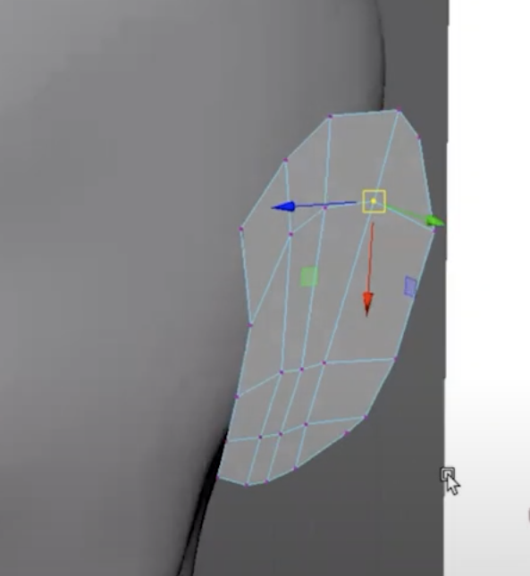
When patch modeling a head, Jackie explains that she starts with a plane (subdivisions width 2, height 1). This plane has an edge running down the center which will allow her to maintain symmetry across the X axis as she extrudes new faces and edges from the plane. She typically places the plane somewhere near the center of the face, such as along the bridge of the nose, and then starts to extrude new segments that follow the form and contour of the face.

Jackie recommends to find a good rhythm as you place new sections – don’t go so far apart that you lose the form, but also don’t go too close together that you end up with too many edges and too much detail. Once she has formed a basic frame that wraps around the form of the head, she uses Fill Hole to start closing the gaps. 

There are various alternative methods to closing these gaps, such as extruding the inner edges or using the Append tool, but Jackie mentions that she prefers to use Fill Hole so that she can add in the topology and edge flow afterwards with the Multi-Cut tool.

Jackie explains that the “rule” to follow here is to determine where the “corner” is, and build your edge flow from that. For instance, all edges on the left and in front of the corner might flow towards the back, while edges on the right and behind the corner might flow up and towards the left. Once you have established the rule for your own models, you can apply it to the other sections as well.

When building out the form of the face, remember that, even though you are only making the exterior “shell,” there is anatomy underneath that is informing the shapes you are building. This is what will help you achieve a realistic and believable look.

Watch the full snippet from an AnimSchool class lecture here:

At AnimSchool, we teach students who want to make 3D characters move and act. Our instructors are professionals at film and game animation studios like Dreamworks, Pixar, Sony Pictures, Blizzard & Disney. ⁠Get LIVE feedback on your Animation from the pros. 
Learn more at https://animschool.edu/
Follow Through and Overlap: Animation Tips

Follow through and overlap are essential principles in animation, adding depth, realism, and fluidity to movement. These techniques not only enhance the visual appeal of animations but also convey a sense of weight, mass, and physics, making the animation more believable and engaging to the audience. Mastering follow-through and overlap empowers animators to breathe life into their creations, elevating the art form to new levels of expression and immersion.

Pro Animator and AnimSchool instructor Philip Hall explains these concepts and how they are used in animation to break up movements.


Key Concepts:

  • Follow Through: Separate parts of a body or object will continue to move after the action has been completed, or after the body has come to a stop
    • Example: When throwing a ball, your arm continues to move after the ball has left your hand; swinging the arm “through” the ball
  • Drag: Parts of a character or object trail behind in an action
    • Example: Flowing fabric or hair will trail behind the body/head
  • Lead & Follow: One section of the body goes first, and another section of the body goes after until all parts of the body have arrived at the next pose
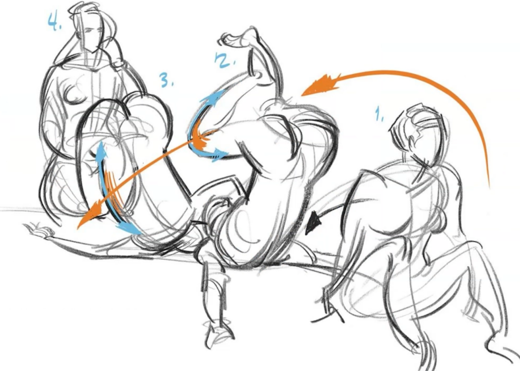
    • Example: Getting up from laying down – the head might lead the action, then the rest of the body follows in an arc
  • Successive Breaking of Joints: As one object leads an action the successive joints bend or “break” in the opposite direction; Joint 1 breaks, then Joint 2, then Joint 3…
    • Example: When raising an arm, you might lead with the upper arm, then elbow, then wrist, then fingers

Philip demonstrates the concept of follow through with a ball and “tail” rig, showing how the tail drags behind the movement of the ball as it moves forward and hits an invisible wall. Once stopped, the back-and-forth movement of the tail is likened to the repetitive motion of a door stopper when flicked.

Watch the full snippet from an AnimSchool lecture here:

At AnimSchool, we teach students who want to make 3D characters move and act. Our instructors are professionals at film and game animation studios like Dreamworks, Pixar, Sony Pictures, Blizzard & Disney. ⁠Get LIVE feedback on your Animation from the pros. 
Learn more at https://animschool.edu/
The Key Poses of a Run Cycle

Disney Animation Supervisor and AnimSchool Instructor Angelo Sta Catalina shares his best tips on animating a run cycle.

In this snippet from an AnimShool class lecture, Angelo discusses the key poses and principles that make a run cycle come to life. Angelo breaks down key poses including the contact, down, push, and peak, providing valuable tips for naturalistic and stylized runs while preserving the core principles of body mechanics.

A run cycle shares many poses with a walk cycle, which typically consists of a contact pose, down, passing, up, and back to the contact pose. However, there are some crucial differences – in a run, the character is in the air for longer than they would be for a walk, resulting in some different key poses.


Run Cycle Key Poses

Contact > Down > Push > Peak > Contact

Contact: Front foot (typically heel) makes contact with the ground
Down: Lowest, most “squashed” pose; the leg in contact with ground is bent
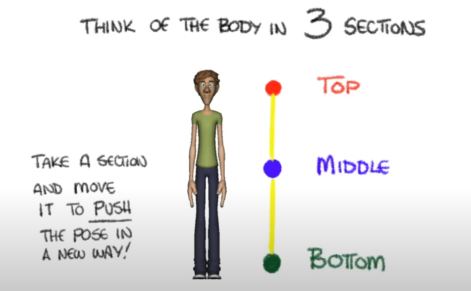
Push: Starting to “push” off into the air; in some cases, this pose may already be fully in the air
Peak: Highest pose; character is fully in the air, and knees generally stay still from previous pose


Reality vs. Exaggeration

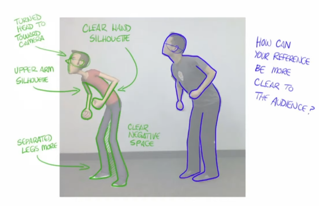
When creating your poses and observing them in your reference(s), think about how exaggerated or realistic you want the run cycle to be. 

In Angelo’s reference of a track runner, he points out a few characteristics that make the run cycle appear more true to real life: in the contact pose, the runner lands on the ball of the foot rather than the heel. The feet are closer together, and the leg that makes contact with the ground is closer to the center mass of the body.In more exaggerated runs, animators might have the character’s foot land farther away from the body; in these cases, it is the heel that makes contact with the ground to compensate for the distance of the foot. 

To achieve the feeling of a weight shift, Angelo recommends looking closely between the contact and down poses. In the contact pose, try to find a straight leg, then contrast that with a bent leg in the down pose. In a more realistic and natural run cycle, the runner may not always completely straighten their leg – animating with this in mind can result in a more realistic animation. However, keep in mind that pushing the poses to have a straight leg can help with the clarity of the overall mechanics of the run. 


Be Aware of Tangents in Your Poses!

Tangents are common occurrences in reality, and you may end up with some in your animation, especially if you are using a realistic reference – just be sure they are intentional, or make small adjustments to avoid them!


Watch the full excerpt from an AnimSchool class lecture here:

At AnimSchool, we teach students who want to make 3D characters move and act. Our instructors are professionals at film and game animation studios like Dreamworks, Pixar, Sony Pictures, Blizzard & Disney. ⁠Get LIVE feedback on your Animation from the pros. 
Learn more at https://animschool.edu/
Crafting the Perfect Animated Pose

In animation, the significance of well-executed poses cannot be overstated. Posing is the foundation upon which character expression, emotion, and storytelling are built. A carefully crafted pose communicates the essence of a character’s personality and intentions, providing vital visual cues to the audience.

AnimSchool instructor Aleksander Kolev explains how to find appealing poses, and how they can be used effectively in your shots.


Asymmetry
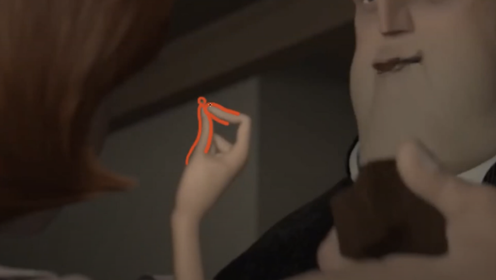
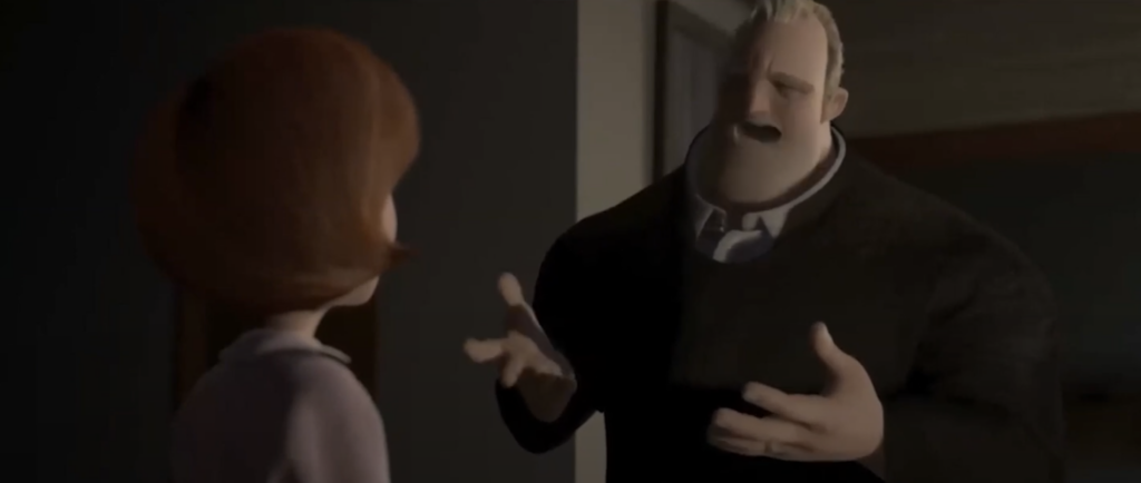
Having both asymmetry in the face and body will keep your poses interesting. Depending on how realistic or unrealistic your shot is, you can push and pull exaggeration in certain places to create asymmetry. This can include subtle changes like raising an eyebrow and tilting a hip, or more extreme changes like stretching the eyes and head. 

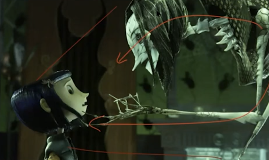
Aleksander also mentions that he uses > and < as a guide to dictate directional poses, such as where a character is looking. For instance, if a character looks to the left, the facial features and head will be positioned so that implied angles form in a > shape to drive the character’s action. (See pink draw-over lines below)


Shapes
Shapes help to define and simplify poses. While it may seem like more of a 2D concept, thinking with shapes can be helpful to create contrast throughout different poses, in both 2D and 3D. Aleksander shows an example of a scene he worked on from Hotel Transylvania, in which a round mummy character, Murray, dances. He explains how he pushed the stretching and squashing of the character to imitate vase-like shapes, and posed the arms in such a way to create flow throughout the form. 


Line of Action
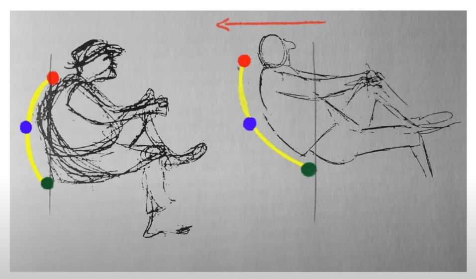
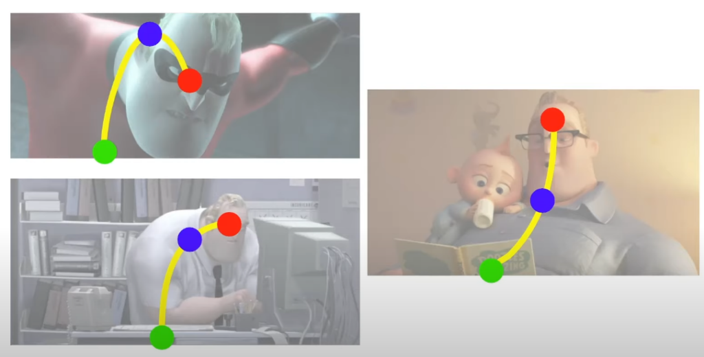
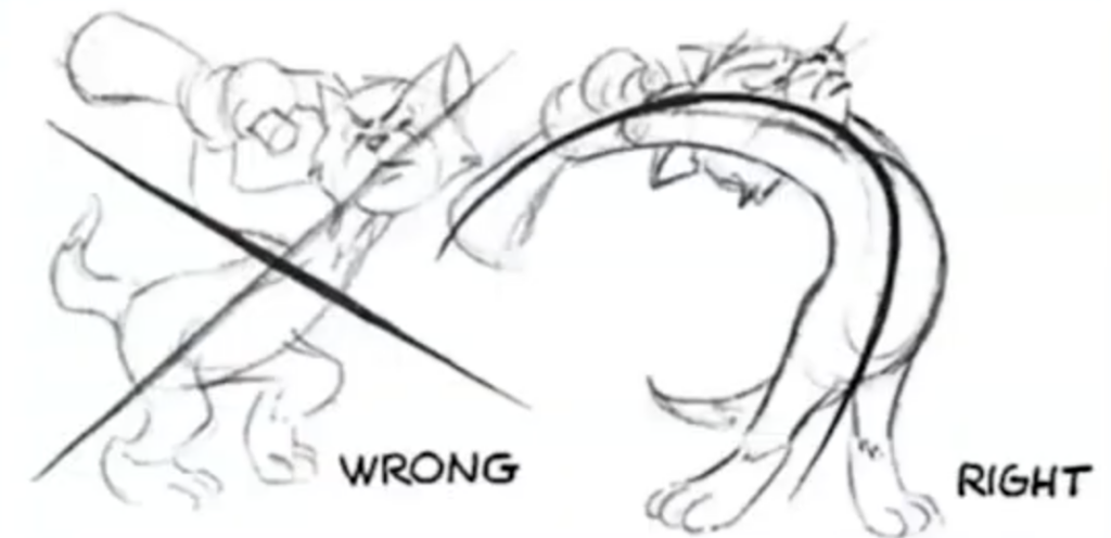
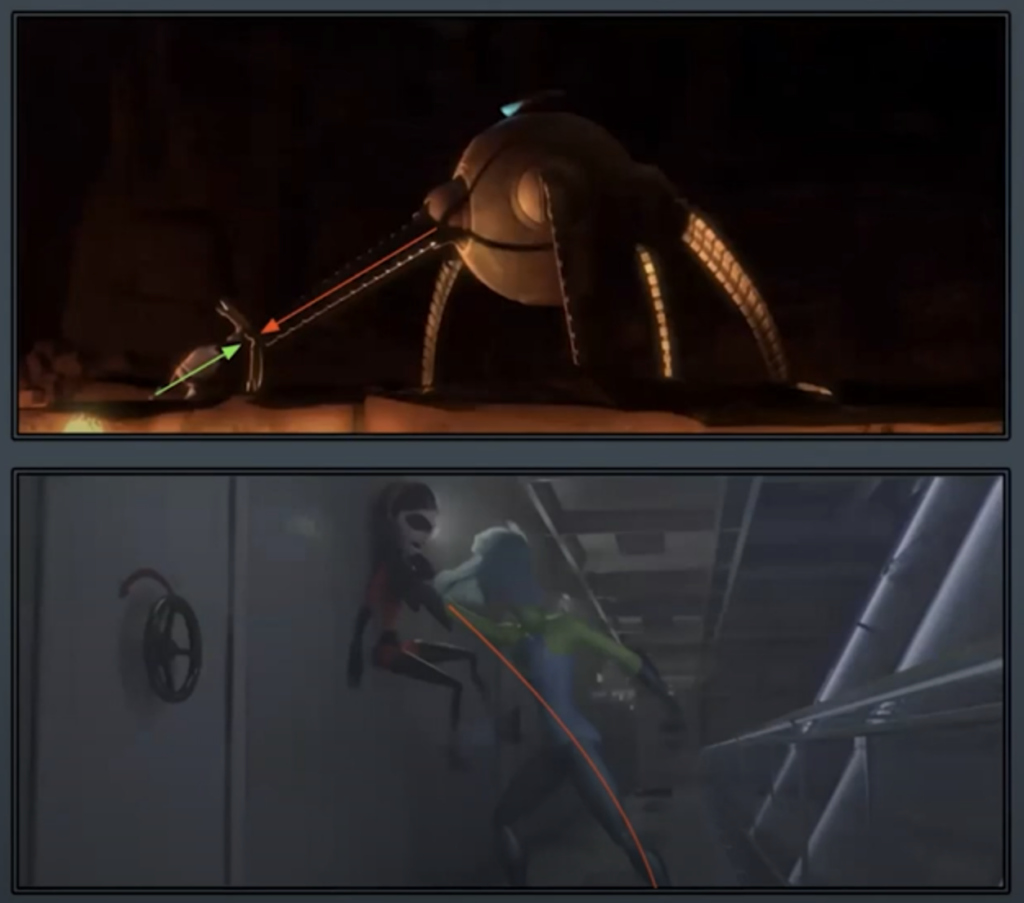
The line of action is the most general line of flow through a character’s body. It helps to focus the audience’s attention, give the character energy and flow, and clarify the character’s pose. Tom and Jerry offers some great examples of utilizing the line of action to depict how energy is transferred with clear posing and action.


Silhouettes
Silhouettes are essential in defining a clear idea of who the character is and what they are doing. When the audience can identify the character and action just from looking at the blacked out shape, it means you have a good pose. Oftentimes silhouettes can be simplified into a general shape that defines the flow and overall form, but more complex and less cartoony animations may result in more complex silhouettes as well. Watch out for tangents as poses and silhouettes get more complex with overlapping objects! Keeping readability in mind is key for crafting any pose.


Watch the full excerpt from a live AnimSchool lecture below:

At AnimSchool, we teach students who want to make 3D characters move and act. Our instructors are professionals at film and game animation studios like Dreamworks, Pixar, Sony Pictures, Blizzard & Disney. ⁠Get LIVE feedback on your Animation from the pros. 
Learn more at https://animschool.edu/
The Basics of Animation Smears

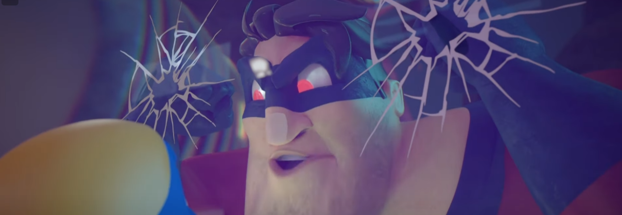
Smear frames bridge the gap between individual frames, contributing significantly to the illusion of smooth, lifelike movement. These subtle, elongated, or stretched frames create a sense of speed, impact, and energy, enhancing the overall visual experience. By strategically distorting shapes and lines, smear frames add finesse and character to the motion. 

AnimSchool instructor Mitchell Jao explains why smear frames are necessary in standard 24fps film animation. Oftentimes, 24 frames per second simply isn’t enough to capture quick motion, and can result in a choppy-looking animation. However, animators can find ways to use this to their advantage and exploit the frames by adding smears and multiples.

Smear Basics
Smears are used to connect shapes that are spaced far apart, mimicking the idea of a motion blur between them. The degree of motion blur occurs as a result of the shutter speed of cameras; at 24fps, the shutter speed is roughly 1/48th of a second. For something like sports photography, the shutter speed would be much faster to capture the shot clearly and with little to no blur for a “freeze frame” type of shot.

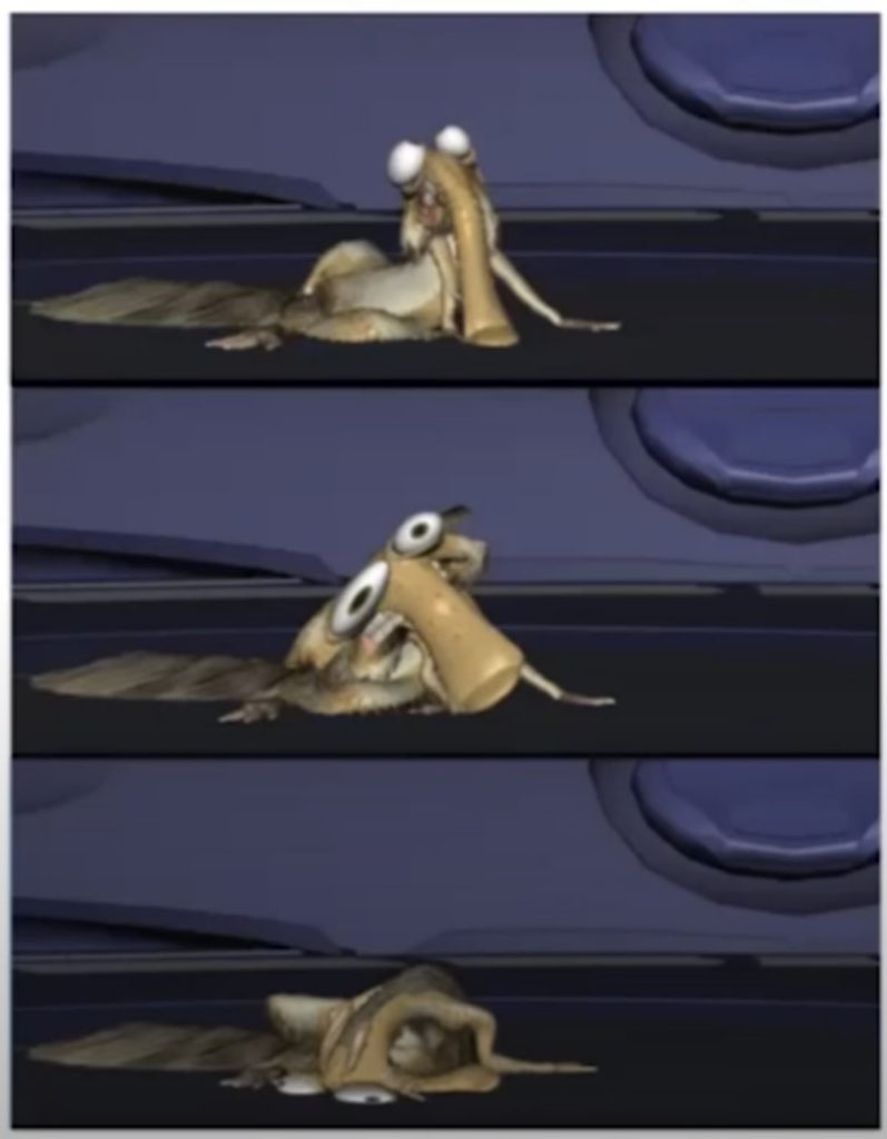
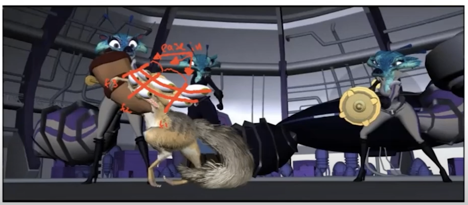
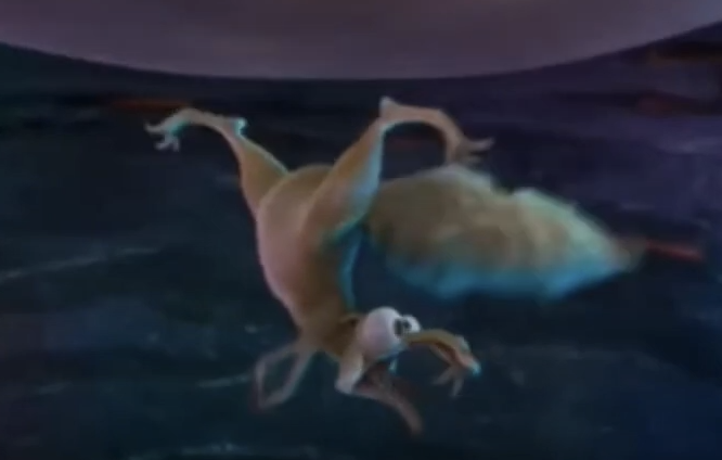
The quick action of smears can also be used to hide mechanics that don’t always logically make sense – Mitchell points out a scene from Ice Age: Collision Course, where a Dino Bird quickly shifts his arm behind his back in a seemingly impossible movement, hidden by the smearing circular movement of swinging another character around.


Multiples and Ghosts
Ghosting can be used like smears, but, when used improperly, can feel like a stuck frame. Ghosts are best used when the movement is so quick that the motion is illegible without them, such as a limb scramble.

Mitchell explains that he prefers to use multiples in a rapid repetitive movement, rather than a singular wipe.

Be careful!
While it is important to utilize squash and stretch, using too much can result in the loss of form, especially if the character or object is meant to be more solid. 


Watch the full excerpt from a live AnimSchool lecture below:

At AnimSchool, we teach students who want to make 3D characters move and act. Our instructors are professionals at film and game animation studios like Dreamworks, Pixar, Sony Pictures, Blizzard & Disney. ⁠Get LIVE feedback on your Animation from the pros. 
Learn more at https://animschool.edu/
Narrative Tips for Animating

AnimSchool instructor Scott Guppy discusses the most common forms of storytelling structure, and how you can use it in your animation to convey a complete story. 

By distilling your narrative to its basic structure, you unlock a compelling journey that resonates with your audience. Keep it concise, and focus on key elements. In simplicity lies the magic that makes your tale unforgettable.

Stories typically follow a three-act structure: Setup, Conflict, and Resolution. As with animation, these rules can be broken; however, we must first understand the rules


Act 1: Setup

  • Establishes a scenario that the audience can identify quickly. Ensuring that the audience can identify the situation quickly is essential for animators.
    • These are typically stereotypical settings (i.e. a western is set in a desert with older, rundown buildings)
  • The setup helps to relate important information about the story to the audience.

Act 2: Conflict

  • This part contains the story; the obstacle that the character overcomes in an escalating fashion.
  • It needs to be interesting and intriguing; otherwise, you will lose the audience’s attention – the ending won’t matter if the audience does not stick around to see it.

Act 3: Resolution

  • Contains the “gag” – the whole point of the story
  • Does the character win? Do they solve the problem and fail dramatically?

Story Tips

Archetypes and stereotypes are important in storytelling – while they may not be entirely accurate or correct, they contain generalizations that are helpful in conveying information quickly to the audience so they know what to expect from the story. Utilizing these generalizations can help keep your story simple and easy for the audience to follow. If you are not purposefully trying to confuse your audience, ensure that your animation is readable and clear!

Who is your main character?
Dive into the mind of your character: gender, age, race, intelligence, emotional state, goals, dreams, etc. Visualizing your character can give you inspiration for what you want to convey with your story. 


Juxtaposition: two things being seen or placed together with contrasting effect
Juxtapositions are useful in creating a joke with the incongruity of two ideas. They can also be used in establishing an idea with a predictable outcome, then deliberately misdirecting the audience to an unexpected outcome.

Watch the full excerpt from a live AnimSchool lecture below:

At AnimSchool, we teach students who want to make 3D characters move and act. Our instructors are professionals at film and game animation studios like Dreamworks, Pixar, Sony Pictures, Blizzard & Disney. ⁠Get LIVE feedback on your Animation from the pros. 
Learn more at https://animschool.edu/
Walk Cycle Animation Tips

AnimSchool instructor Janel Drewis breaks down the basic steps, and how video reference is used as an aid to achieve believable character movement.
Achieving a natural and convincing walk is deceptively simple. A successful walk cycle animation requires a keen eye for the intricacies of human movement. It involves mastering complex details such as weight distribution, timing, balance, and coordination all while ensuring the character’s movement matches their personality.

Walk cycles do not employ any one specific Principle of Animation – a good walk cycle incorporates each principle in some manner. Because walks are so familiar to the human eye, audiences are extremely aware and can easily identify when a walk looks off or is not believable.


Main Poses of a Bipedal Walk Cycle

  • Contact: front heel makes contact with the ground
  • Down: hips are at their lowest; “bottom” position
  • Passing: back leg passes the front leg
  • Up: hips are at their highest; “top” position

Walk Timing
In a standard walk cycle, the four poses above are spaced evenly throughout. Most people walk “on 12s,” which means they take one step every 12 frames, or roughly two steps every second at 24fps. Animating walk cycles on 16s or 8s was more popular in older 2D animation because animators did not have to split the drawings on thirds like they would have for animating on 12s.

Other Tips
When looking at a reference video, make note of how much the hips drop/rise and how straight/bent the legs are. Additionally, pay attention to the spacing of the feet between frames; this will affect the ease in/out between steps.
To loop your walk cycle, ensure that the pose of your final frame matches your initial frame – you can do this by copying and pasting the initial frame. This will ensure seamless looping. To play this loop continuously, select everything and activate Curves > Pre Infinity > Cycle with Offset and Curves > Post Infinity > Cycle with Offset.


Watch the full excerpt from a live AnimSchool lecture below:

At AnimSchool, we teach students who want to make 3D characters move and act. Our instructors are professionals at film and game animation studios like Dreamworks, Pixar, Sony Pictures, Blizzard & Disney. ⁠Get LIVE feedback on your Animation from the pros. 

Learn more at https://animschool.edu/
Animators are Actors

AnimSchool instructor Masha Juergens explores the process of getting into character from behind the camera. 

Acting for animation is a unique art form, where animators bring characters to life not just with the use of technology, but through the use of their own physical and emotional performances. With boundless creativity, they craft compelling personalities that resonate with audiences of all ages, making animated worlds come alive on your screen.


Animators vs. Actors

  • Animators focus on externals in characterization and caricature (facial expressions, body movement, emotional reaction, etc.)
  • Actors, by contrast, learn specifically notto focus on these things because they are “results” – you cannot act results.
  • As an animator, you must understand what your body is doing, what your emotional status is, etc., and translate all of that into a digital space and onto a model.
    • The challenge comes from making your audience feel like your character is alive, not because they are moving around onscreen, but because they are thinking and have a personality that makes them unique!
  • You don’t have to be a physically great actor to be a great actor in your mind, and in turn a great animator!

Becoming a Better Actor

To get better acting in your animations, you must become a better actor. Get into the head of your character – try to figure out and better understand where they are from, what their personality is, what their motivations are, etc. It’s not just about portraying a clear external (happy, sad, etc.) – try to look deeper for an internal feeling, or consciousness
Identify the character’s emotional state and use the thought to drive the action, not the dialogue. When there is a change in the character’s emotional state, change the character’s main pose. Be careful here: don’t change poses simply because there is a new emphasis in the dialogue!


Adding Beats in Animation – Emotional Hang Time

When a character is feeling one emotion and something happens to make the character feel something else in the same shot, the character needs to have a moment to process before the emotional change can take place. Building beats into the animation can show that the character is mentally absorbing and processing the events that are occurring in the shot. These moments can be quick, but readability is key.


Watch the full excerpt from a live AnimSchool lecture below:

At AnimSchool, we teach students who want to make 3D characters move and act. Our instructors are professionals at film and game animation studios like Dreamworks, Pixar, Sony Pictures, Blizzard & Disney. ⁠Get LIVE feedback on your Animation from the pros. 


Learn more at https://animschool.edu/
Page 3 of 3