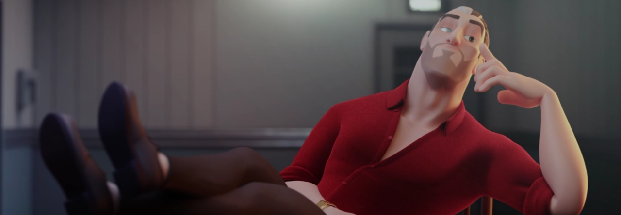
We recently had the chance to interview AnimSchool instructor John Paul Rhinemiller and talk to him about his journey from being an animator for feature films to a game developer at Vicarious Visions for the past ten years. Keep reading to get a taste of what working in the game industry is really like and whether it’s the right choice for you.
Tell us your story! What got you into animation?
It’s not something I knew from the start. It’s more a series of events that led me to want to be an animator. I always was into art but never put the two together until I attended McCann Technical High School where I focused half my time on Computer Assisted Drafting. I loved the computer side of things but not so much the mechanical drafting of parts. After high school, I attended a local community college and took an elective course in animation, and the marriage of computers and art for me is what I needed. I never looked back.
Did you always go for games specifically or did you explore films and TV first?
I think I always had the film itch, just like a lot of students do. They get it into their head “Film is the thing that we have to do. If I don’t reach film, I am not a success story.” It feels like film is the pinnacle of animation sometimes. In a lot of schools back in the day, a lot of programs were set up like that because the game industry was this weird insular thing. There really wasn’t a lot of exposure to games. So I gravitated towards film in the beginning. I worked as hard as I could to get in, and then worked in film for a few years. It wasn’t until my wife was looking to go back to college that I came across Vicarious Visions in New York. It felt like, “Ok let’s go there for 2–3 years while she gets her degree and then I’ll go back to film. That’s the plan.” I got there and interviewed, and the environment throughout the interview process was just a breath of fresh air. I got to interview with people from all different disciplines, not just animators, and they all wanted to know how I would collaborate with them. There are just so many more opportunities to collaborate since the teams are so much smaller. Over the years at Vicarious Visions, I learned a lot about being an artist and game developer, not just an animator. It provided this opportunity for growth that I don’t know I would’ve gotten in film because it’s so specialized. Sometimes there’s very little room to lift your head up and see what’s out there in film, but in games they encourage that. They push you to follow what you’re passionate for and want to go after. Even after I shipped a project, I’d think about looking for another job but then I’d think, “The next project looks really great and the studio has been really good to me and I’ve learned so much so why don’t I just hop onto the next project?” Before you know it, I’ve been here for 10 years. And I’m not ever going back to film, I’m a game developer now!
Can you talk a bit more about the key differences between animating for video games versus film?
Honestly, the amount you are involved in the entire process with animation in games can be very different from film. I have been able to collaborate with so many departments that it allows me to enjoy being an artist and an animator. The teams are smaller, so even when I interview people now, I’m looking at how their voice is going to impact my team. At a game studio, there can be six animators on a team. When I was at the Rhythm and Hues, we had 90 animators on a team for a short project. My personality is big, and I try to get to know everyone, but at a game studio, you really get to know everyone and you have to work together to solve problems. As an animator you want that quality to be shown, and if there are technical issues, you have to work together to solve them so the rest of the team can be proud of what we ship. You can be involved as much or as little as you want to be. If you want to be heads down and just focus on being a good animator, there’s room for that. If you want to solve technical problems and want to work and collaborate outside of just animation, there’s also room for that. We expect animators on our team to have more of an impact and a voice. We really want their voice to shine through, because your perspective is very important to round out our team and help give us the different pieces that come together to help us ship a good project.
A lot of student animators aspire to animate for the big screen. Could someone start off in games and transition to film or vice versa?
I feel like the difference between the quality of animation in film and games is narrowing all the time. This means that the qualities each look for are also narrowing. The foundations are super important as your building blocks. One thing that transfers to both industries is showing a wide range of styles on your reel. One thing that sticks out is many of the studios want animators to think like game developers as well. It’s important to hone your craft but understanding how games get made is super important to continue to push this medium further. With tools and pipelines, knowledge does not always transfer one to one.
Can you elaborate a bit more about what you mean by “think like game developers”?
Game development is a process you have to see in real-time. Cinematics can be isolating when you do large, full-scale movies. When it comes to game animators in general, it’s not just about your animations. You have to get it into the game and see the responsiveness of your controller or PC. When you put it in a playtest, they’re immediately talking about how responsive it is, how it feels and what their experience is. And you as an animator have to interpret this and work with designers to make sure that responsiveness not only looks good from a visual standpoint but also plays well with the gamer who’s thinking, “Well this guy isn’t turning fast enough so I can’t get over here fast enough…” There’s a level of responsiveness that has to go back and forth with the game and player. When you understand game development, then you can craft and tailor your animations a little bit differently in the beginning. Your approach might be slightly different compared to a shot that’s just going straight onto a screen in a film. I was an animator when I started, but now I’m a game developer first. I know what animation systems it takes to make the animation run well in games. I have to understand game development in order to know how to make the animation shine.
How well versed in video game programs such as Unity and Unreal do you need to be to animate for video games?
It is a plus and we teach some intro and basic setup in our game courses. From my experience, as a junior animator coming in, we like to take into account that new hires will need some guidance and mentoring along the way. Getting experience in an engine will always start to set you apart. As real-time rendering becomes more and more widely used in the industry as a whole, it will only serve you better to get some training.
In your class, you also teach cinematics. In the industry, how often do you animators utilize knowledge about cameras and cinematography?
It all depends on the size of the studio that you work at. The larger teams tend to have layout artists. That doesn’t mean you won’t touch cameras or have a say, but it may not be your primary job. At Vicarious Visions we want our animators to have a good understanding of cinematics as a whole and be active participants in the development of our story content so understanding the foundations of cameras and cinematography is certainly a plus.
What’s your biggest piece of advice to students?
Two things:
1. Everyone’s timelines/journeys are different. If you chat with someone working in the industry, most of the stories on how they got there are different. So stick with it if you are passionate. Someone may land a job right after school and someone else may take a year. That’s their journey. You have to continue on that journey and continue to find that passion in order to make it happen. If you continue down that road, continue to be passionate, and continue to put your all in it, you’ll make it into the industry.
2. It’s easy to get distracted by all the areas within school so FOCUS. The earlier you can figure out what you want to focus on the better off you will be and more practice and iteration you will have under your belt. If you want to model FOCUS on that…if you want to animate, do that as much as possible. There’s plenty of time for you to learn other things afterward, but if you want to get that job, it is very competitive and you need to focus as quickly and as early as possible in your studies.
What are your biggest demo reel tips for those trying to get into the game industry?
Only put your best on there. If that’s 2 pieces then so be it. Organizing your reel around consistency and pacing can show really well. Variety! Showing your range to potential employers can help set you apart.
You’ve clearly animated a variety of characters and styles. How do you film references for creatures that don’t exist and make them feel believable, but also have character/personality?
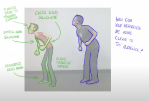
What a great question! Many places I had would bring in animals if possible for us to take time and study. One good way is thinking about 1-2 features that could ground that creature in reality. Talk to your lead or get input from the team and then you have a good starting point for reference gathering. If you can add something that people can connect with it can help make these fantastical creatures feel a little more believable.
How do you use MoCap in your game animation pipeline?
For the first five years I was here at Vicarious Visions, we didn’t use it at all. Since working on the Destiny franchise, we transitioned and have been using a mix of it since. We still feel it’s really important to be a good animator at the core. We look at MoCap as another tool for animation to use. You must have solid foundations to build off of. If we are talking from an execution standpoint, we have lots of resources across Activision. They have a large motion capture space for anything that requires that level of effort that we use from time to time, and we also have an Xsens suit that we use at the studio.
In your class, how do you push your students to create industry-level work?
We focus a TON on iteration and feedback. One of the biggest things I push is Weight, Timing, and Spacing. I feel these are some of the important building blocks to an animator’s foundation. Without being able to show this off in your work, it is hard to see past the mistakes. They don’t have to be perfect, but the sooner you understand this the faster you can show the potential you have as an animator to potential studios.
Where should I start if I only have a little bit of animation experience and want to be a game animator?
There are lots of resources out there nowadays but I like to think we have a good veteran group of game instructors here at AnimSchool. We are constantly trying to evolve the curriculum as the gaming industry evolves as well. We need to be agile just like game development in order to help provide the best training to our students. We care about our students and really work to help them succeed with their hard skills as well as their soft skills.
What’s the biggest advantage of taking live classes instead of learning from online tutorials?
The interaction that I have with the students individually and drawing over and being able to explain what’s in my brain about animation is so much easier. I can see what’s on the page and interpret their animation skillset and give appropriate, individual feedback. They can ask me questions in real-time while we’re going back and forth, and we jam just like we would in a studio. During dailies at a studio, if you don’t understand it, then we continue to hammer on it until it clicks. It’s not just about draw-overs, we’ll open up the files and I’ll do the note, show it to them, and then they’ll go back and do it on their own. You can listen to or read something, but are you getting enough clarity in order to interpret it in the way you see animation? Everyone understands and sees things slightly differently. We also get to talk about the industry as a whole. Some of the discussions for the first 5-10 minutes of class are about the industry: how you can advance your career or get better at an interview. There’s so much I’m trying to give these students in only 11 weeks. We try to inject as much as the other stuff that’s going to get you a job. Your reel is the 70% that’ll get you an interview, but if you go into that interview unprepared, you might not get it. We really try to inject a whole lot more about the industry itself (how to succeed and how to get in), rather than just the skillset. There’ll always be time to grow the skillset, but how often do you have the opportunity to ask someone with 20 years of experience questions about the interview process or how to tailor your reel? Those kinds of things are gold that never really get seen in a curriculum.
What kind of person should pursue the Game Animation track?
There’s a lot of stigma that you have to be a big gamer to go into games and that is not true. I was a casual gamer growing up, but I wasn’t a hardcore gamer that knew from day one that’s what I wanted to do. There’s a love of animation in this industry just like there is in film. The thing that AnimSchool has done is set up tracks to help you understand the multiple facets of being a game animator. Whether that be cinematics, whether that be motion capture, whether that be gameplay animator. The Game Animation Track gives you a good foundation of touching an engine for the first time, getting your stuff in an engine, and being able to present that work on your demo reel. If you want to see where this industry is going and have a different perspective on how animation can be a part of the community and touch people in a different way, then this is for you. Games are an experience. And there’s so much new tech out there that allows us to interact with a community and the people playing our games. Games are still in their infancy as an art, and I think AnimSchool does a great job of capturing that base foundation so that when you get out of school, you’re not completely lost.
Can you talk about the gender gap that exists in the game industry?
As we continue to develop more young talent and more young gamers, we’ve seen some good growth in the diversity of the new hires we’re getting out of school. However, we definitely need more diversity in games in general, but we also need more females. The thing that this offers is different perspectives. We need those different perspectives in our industry to help create great ideas and good experiences that everyone can enjoy and that represent everybody. Those perspectives are going to help us develop games that people want to play in the future. The gaming industry as a whole has done a better job of being more self-aware, but we have a long way to go. Young female gamers can be part of that change and drive to evolve our industry. It offers a completely different dynamic to our teams and it makes us better. That diversity and inclusion make our games better and just make us all better.
How has working during the pandemic been for you? Do you think video games will shift more towards remote work than it already was?
This is a tough question. While I think we have been successful and very productive, I feel we lose a whole side of our industry that makes it special…the culture. We give it a good try, but trying to inject the fabric of a studio through Zoom boxes will never be the same in my opinion. I feel the collaboration and excitement of being around other creatives can never be replicated from a screen. Part of why I love this industry so much is all of the little interactions and events that happen at a studio that we miss out on when we’re remote. I do think that we can strike a balanced approach of hybrid and many studios are, but moving to the extremes of all WFH or all in the office could definitely change moving forward.
What are your favorite games at the moment?
There are two games that have affected me in two different ways. One: The Last of Us 2. I was playing it at the beginning of the pandemic and that story….it felt like an episodic HBO series that I could not wait to pick back up again and see what happened next. And I was interacting with it—I was actually in there—so there were moments that were really tense and I’m gripping the controller super tight and holding my breath. I can’t remember the last time I played a game like that. With technology getting really good and the amount of time and effort those devs put into that game, it was just a really good immersion of story with an experience from beginning to end. There’s really not a lot of lag time in there. I really felt engaged the entire time. That one stuck with me and it will for a while. The other one is Spider-Man. It’s the first one that my son and I really played together. I’ve started to slowly age him into games and try to keep it as PC as possible, for as long as possible. But that was the first one that I opened up and he saw me playing it, and for 3-4 months I just let him swing around the city. And that one mechanic was so enjoyable to do; to learn about and to watch. They did such an amazing job of creating the experience of swinging through New York, so I just let him do that. Then we finally started the game and we 100% it. All the missions, all the quests. I can’t tell you the last game I’ve 100% a game! My son has played some of the games that I’ve made, but this was the first time we were in it together for the journey.
Where do you see yourself going in the future? Games, film, or something new?
Games are my future. I am a game developer first and an animator second. The future of games and how we tell stories to interact with our community is still evolving. It’s exciting to be a part of and if I’m lucky I can continue to be a part of this industry for some time.
Level Up in our Game Animation courses taught by industry pros:
Intro to Game Animation | https://lnkd.in/gXc9pta
Instructor Jarrod Showers
Game Animation Pipeline | https://lnkd.in/ghxXh5M
Instructor Seth Kendall
Advanced Game Animation | https://lnkd.in/g4Myfzi
Instructor John Paul Rhinemiller
Learn to be a Game Animator in our next 11-week term at animschool.edu

