Sean Sullivan: Rule of Thirds in design

Most of the terms at AnimSchool.com have a complimentary free Art class, teaching students painting, design, character development or drawing.
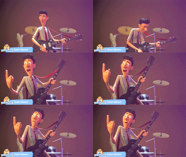
In this video, Sean Sullivan, who worked as a background and Visual Development artist at Disney, talks about how Rule of Thirds can help you make better poses for your animation shot.

To learn animation, come join us at our online animation school website: http://www.animschool.com

7 Questions You Should Be Asking Your Instructors


Sometimes it’s hard/awkward to speak up and ask questions in class (I know this all too well, as I am guilty of it myself). However, the instructors are there to help you learn and grow. They want you to ask questions so that they know how to teach you better and what to spend more time on. They won’t know what you are struggling with unless you tell them.

But what should you ask? What kinds of questions will be the most helpful? Here are some examples of what you should be asking to get the most out of your online animation training:

Knowing what the weakest part of your project is means knowing what you need to work on the most. Putting some extra time into these areas can push your work from good to great.

At the same time though, it can also be a bit of an ego booster to know what your instructor thinks is your strongest area. It might seem awkward to ask, so you could reword it to something like, “Is there any part of this that you think is in a good place? Something that I shouldn’t worry about as much anymore?” While critiques shouldn’t be taken discouragingly, they can be hard at times when all of your project’s flaws are being pointed out. The point of this question is not to get overconfident in your work, but to be encouraging and help you feel a little better about it.

There are times when it seems like you might be on the right track but something just feels…off. From some angles or positions maybe it looks pretty good but from others it is kind of awkward and you are not sure why. Even if you and your instructor can’t quite pinpoint what exactly might be wrong, it’s good to at least point out the most awkward parts so that you can experiment in making them feel more natural. 

While this is the most popular question that actually does sometimes get asked during classes, it’s also the one that gets the most passed up. I know it seems rude to interrupt, especially for an introvert, but if you don’t, then most likely you will miss your chance to find out how something was done. Whether it’s during a lecture, your own critique, or even someone else’s, it’s important that you always try to ask how to do something if you don’t understand. No one will care that you are interrupting because, chances are, other students in your class were wondering the same thing but were too afraid to speak up.

Most instructors will probably give you some guidance on where to look for helpful resources. However, just in case they forget or only went over it briefly, you should consider asking for more. They’ve probably been doing this longer than you and have therefore collected a goldmine of helpful websites, books, extra classes, and any other related resources you can think of. So don’t be afraid to ask for these things because I guarantee they would be more than happy to share them with you.

Okay so you’ve been critiqued, you know all of the things that need fixed, cleaned up, or improved. But…where do you start? Asking this question will give you a clear next step instead of a potentially overwhelming list of things that need done. Your instructor will probably have a good idea what he or she would do next, so why not find out?

Just because your class is ending and you’ve turned in your project for final grading, doesn’t mean you should stop working on it. Twelve weeks is not a lot of time to get a model/rig/shot 100% completed, even for professionals. There is always room for additions or improvements. In your final class, maybe during the one-on-ones, it’s a good idea to find out what those things are. What can you do to push your work to stand out from all of the others that are looking to get the same jobs you will be applying for?

I’m sure most instructors won’t mind you emailing them for feedback after your class with them is over, but it is always nice to ask as this can create a relationship with them outside of class. One of the most important aspects of the animation industry is having connections. The more instructors you keep in touch with, the better your demo reel will be and the more professional connections you will have when job hunting.

If you found these tips helpful and would like more blogs with advice about how to get the most out of your classes, critiques, etc, let us know either in the comments below or on the facebook post.

To learn more from one of the best online animation schools, please visit animschool.com

Texture and contrast with Jeremy Lazare


In AnimSchool’s 3D animation class for body acting, animation instructor Jeremy Lazare talks about adding texture and contrast to a shot in order to make it stand out.


“Looking for top 3D animation schools? Apply today for our 3D online animation classes at www.animschool.com

5 Common Modeling Mistakes and How to Avoid Them

Mistake #1

Too Many Subdivisions, Too Early

Unnecessary geometry can get in the way in the beginning stages and it’s sometimes hard to go back once you get too much. The higher the subdivisions, the harder it is to make changes while blocking out the forms and proportions. It can make the surface unnecessarily complicated and lumpy.

Solution:


While the industry standard for model resolutions has gotten higher throughout the years, it’s important to remember to start low. Often times you can make the same shapes with less polygons. But at the same time, don’t let this scare you into not adding more topology as you progress. When you need more edge loops, you need more edge loops. The key is just to start low and slowly add more as needed. 

Mistake #2

Messy Topology and Bumpy Surfaces

Clean geometry = a stronger and more functional model.
It’s easy to get caught up in the forms and ignore the topology. Just remember that every once in awhile it’s important to clean things up.

Solution:

  • Make sure there aren’t any stray vertices that are breaking the flow of the edge loops.
  • Try to keep edge loops evenly spaced and quads as square as possible.
  • Look at your model from all angles to find little bumps in the surface that need smoothed out. 

Mistake #3

Triangles and Ngons

One of the first things you learn in the character program at AnimSchool is: quads good, triangles and ngons bad.

But what are triangles and ngons?
An ngon is a face or polygon that is made up of five or more edges connected by five or more vertices. Anything over a quad (4 sides) is considered an ngon. And of course, a triangle is a polygon with 3 sides.

Why are these so bad you ask?
There are several issues that they can cause but the biggest is that they can create odd and unwanted deformations when rigged to be animated. If a rigger finds tris or ngons in your model, it will immediately be sent back to you to fix them. They can also cause issues further down the pipeline when smoothing and rendering.

Solution:

Quads, however, are universal and generally play nicely with all aspects of the animation pipeline.

Mistake #4

Incorrect Proportions

Proportions are one of the most crucial things to get right in 3D modeling. Get them wrong, and it will throw off your entire model. You have to train your eyes to make comparisons and estimate depth. Of course, allowances can be made for style, and in the end, if you are working off of concept art, certain exaggerations would have to be allowed.

Solution:

  • Break the model down to the most basic shapes, that way you can easily adjust them according to the concept art.
  • If you have multiple views of your object, then the use of image planes in orthographic views become very useful in judging proportion. However, try not to spend too much time in the orthographic views because it’s more important that it looks right with perspective.
  • Another trick is to open the concept art in an image viewer program (outside of Maya), line up the concept and model so that they are directly on top of each other (same size and angle), and then quickly flash back and forth between them. This can help you notice more differences in your model to more closely match the concept art. 

Mistake #5

Worrying Too Much, or Too Little About Topology

Modeling (like most things in the animation industry) is a balancing act between the technical and creative aspects. They are equally important for both appeal as well as functionality. It’s easy to get hung up on one or the other for too long.

Solution:

One of the best ways to approach it is to think artistically and focus on the forms for awhile, then give yourself a break by just going through and doing a little clean up. In the end, what really matters is how closely the 3D model looks to the original concept art. Just remember to always keep the topology in mind while you are interpreting the art.

For more animation training at one of the top online animation schools, please join us at www.animschool.com

5 websites to feel the magic of animation!


An animator always craves to make an animation shot that makes people go, “wow!” (with or without stepping back with surprised face but preferably with). One of the best moments of an animator’s life comes when people feel the emotions of the character(s) and forget that the shot is an animated shot. That feeling that you are making someone laugh, cry, happy or sad just by animating is an amazing feeling and is the basic drive behind the animators’ struggle to become better at their job.


In order to be better at this craft, animators spent countless hours animating, studying live action or animated movies. In short, training eyes to see animation, beats, arcs and motion which brings me to my first website of this blog.


A typical post on frame by frame looks like this:

What is really really cool about this site is that more or less all gifs have a beautiful pattern to them. You might have watched the movie, the gif was from but missed that particular beat or small movement that made that animation so interesting. It has examples from all types of animations and once you get to know this site, it is hard to get out of it.


Second website that I would like to introduce is one of my top favorite sites and it is all about smear frames. 


 Smear frames is the first thing after the bouncing ball that animators get obsessed with. These become such an obsession that even when a shot does not require smear frames, they get put in (sometimes furiously and stubbornly) because look at them; they are so cool.
It takes quite a while to understand where to put them effectively and for this, you need really good teachers.

Once you know where to put a smear frame effectively, it becomes much more than just a frame; it becomes art. This site helps bring that art, otherwise lost in motion, in front of us and trust me, it is beautiful.


Third website that I want to bring into this blog is one of the most incredible blogs that I ever visited and it is called the “Living Lines Library.”

Living Lines Library

This library is one of the most beautiful websites, dedicated to animation industry. It features pencil tests, model sheets, production art, documentaries and artists from almost all animated movies.

Where else will you find beautiful pencil tests like this one:


And beautiful drawings like this.


It is a gold mine for a person who has penchant for animated movies.. Go crazy!

Fourth website is


It’s a crazy website. What it does is that it takes a movie and then puts all the frames of it on its website. It is also a pretty fast way for an animator to check a scene and analyze it because all the frames are there already. It also gives you an option to download images of a particular gallery in a .zip file. Pretty cool, eh!

Inside out 2015

The fifth and final website is


Cartoon Brew is one of the most famous websites to get information regarding animation. It is always breaking news regarding animation world, announcing new movies, giving information regarding animation festivals, topics to debate about and new artists and animators to watch out for.  The most interesting thing, for me, though is their daily picks of the day: videos (animated) and artists. It is inspiring to see so much variety in animation and sensibilities that artists around the world bring to their art. For me, this website opens one’s mind and is essential to broaden one’s horizon. It pushes you to find your own voice and get motivated. Bookmark it!

Cartoon Brew Pick of the day:

‘Loop’ by Michal Socha


Thank you. I hope you enjoyed these 5 websites. 
To learn animation, join us at animSchool.com where we offer online animation classes to help you become better animator.

10 Quotes for the Aspiring Animator

“Animators can only draw from their own experiences of pain and shock and emotions.”
-Hayao Miyazaki


“The secret source to animation is truth.”
– Pete Docter


“The strength of animation is in its simplicity and caricature, and in reduction.”
– Pete Docter


“Animation is about creating the illusion of life. And you can’t create it if you don’t have one.”
-Brad Bird


“All the technical considerations are unimportant when confronted with the question of ‘Does it look right?’”
-Ron Brinkmann


“Animation is not so much about moving stuff as it is about moving the audience.”
-Glen Keane


“Believe in your character.”
-Glen Keane


 “The better we [animators] do our jobs, the more invisible we become. The characters become the real ones.” -Glen Keane


“If the character emotes authentically, it has a power to connect with the audience.” -Rob Minkoff


“Animation means to invoke life, not to imitate it.”
-Chuck Jones


To come and learn at one of the best online animation schools, please visit animschool.com

A Guide to Making Modeling Demo Reels with Brien Hindman

Brien Hindman is an environmental modeling supervisor at Disney Animation and an Instructor at one of the best 3D animation schools– AnimSchool. Previously, he was a senior modeler at Blue Sky Studios as well as the environmental modeling lead for Ice Age 3. Films he has worked on include: Moana, Big Hero 6, Frozen, Wreck It Ralph, Epic, Ice Age: Continental Drift, Rio, Ice Age: Dawn of the Dinosaurs, Horton Hears a Who!, Ice Age: The Meltdown, and Robots.

As he himself is one of the many modelers at Disney who watches incoming demo reels on a regular basis, he gives his students lots of advice about the best, most effective ways to create their demo reels. Despite being a very busy guy, Brien agreed to share his insight with all of our readers.

What are the guidelines you tell your students when making a turntable?

Be sensitive to screen time. Remember that professionals are looking at your work, and they can tell within a few seconds if it’s good or not. It’s important to keep the energy of a demo reel up, so you don’t need to make the turntable excessively slow. Generally about 3 rotations within 5 seconds is enough, which includes almost a full rotation with the wireframe comped onto the model. Start the turntable almost a full second before the most important side of the model, which typically includes the face. This gives you time to cross dissolve from your previous model, as well as giving the viewer enough time to figure out what she or he is looking at. It’s a bit annoying to have to wait a full second to see the face, but I’ve seen many turntables that start out on the face, but includes a cross dissolve, so we are essentially seeing the backside of the model first. It’s a good way to kill the moment of the demo reel. Further, end the rotation in a smart place. It doesn’t have to be where you began it, but you want to leave the model in an interesting place. It makes a better impression. Generally, 2 seconds or so per rotation is good, but it really depends on the model. I would say 4 seconds is pushing it in terms of speed.

In general, what should a good modeling demo reel look like in terms of length, variety, and number of models?

Longer demo reels do not constitute better demo reels! It’s better to make a shorter, stronger demo reel that is 1 minute long than pad it with an additional minute of mediocre work. Don’t overstay a model’s welcome. You’ll only annoy the professionals. Remember, they have a dozen others to get through, as well as get back to work. You’re not fooling anyone by making the demo reel by including that crane up rotation in addition to the standard demo reel rotation.
Consider who you are sending the demo reel to. Your demo reel is a commercial, as well as an extension of yourself. Variety is usually good, as it implies you are willing to work on sets as well as characters. Further, different styles show you are adaptable and have a good eye. From one project to the next, the style can be very different, and an employer will want to see you can produce from show to show.
In general, I tell my students they should include a variety of body types, genders and styles. A hyper real character is good to include as well, but if it’s a feature animation studio, they won’t want to see an entire demo of hyper real characters. Conversely, a video game studio won’t know what to do with stylized cartoon characters for the most part. Environments are important as well. An interior with plenty of scale cues is a good choice, as is a stylized car if it’s for a animation studio, real otherwise, as well as an exterior organic environment. Making trees is hard. Most people are terrible at it. Hard surface is good to demonstrate as well, but that is usually covered by the interior.

What makes the best arrangement of models, for example should the best ones be at the beginning, the end, or a little of both?

Many people have different opinions on this matter. I think best first, second second and third last is best. You may only have 10 seconds to get someone’s attention before they move on to the next demo reel, so it’d be a shame if they never saw what you consider to be your second best work if it is last. That said, you want to end strong and leave a good impression. The third best model is generally enough to do that.

Should our modeling reels differ depending on the studio we are applying for? If yes, how so?

Yes. In addition to what I mentioned, consider each prospective employer a client. Said employer generally is not going to want to think outside of the box. If they can directly apply your skills to their needs, you will have a better shot.

You guys look through hundreds of demo reels all the time and I’m sure they all start to look the same. How can we make ours stand out from the rest and be remembered?

Follow everything above. Generally, HR screens the demo reels for us, and then we look at the top picks. You have a lot of hurdles to get over, so if the demo reel is entertaining from beginning to end without music, then you have a good shot. An easy way to stand out is to not build the same kind of characters or models as everyone else. Anime characters with giant swords are generally a good way to be forgotten. Everyone does it.


What are some common mistakes that you often see people make in their modeling demo reels?


They add music. They don’t show wireframes. They add models that they shouldn’t have added that aren’t nearly as good. It shows a lack of judgement in that case. Remember you are saying you think these models are the very best you can do. If you don’t think it’s the very best, then don’t include it.
Don’t model well known 3d characters. Someone with more experience has already done it, and so you are inviting a comparison between someone with 15 years+ experience and yourself.

Any final words of wisdom?

Make your demo reels as modular as you can, so you can drag and drop turntables in with as little effort as possible. The more customizable the demo reel, the better you can tailor it for a prospective employer.

Thanks Brien!

To learn more about AnimSchool’s online animation programs, as well as Brien’s Intermediate Modeling class, please join us at animschool.com

Justin Barrett: Maya’s rotation tool and its Gimbal mode

In this clip from a class lecture of “Introduction to Maya,” AnimSchool instructor Justin Barrett talks about rotation tool and how to effectively use its gimbal mode.

For more helpful tips, come and join us at www.animschool.com

AnimSchool Interview – Dylan Hoffman

Former AnimSchool student Dylan Hoffman was incredibly fortunate last year to have had the oppurtunity to intern at not just one, but two of the industry’s most well-known studios, Walt Disney Animation Studios and Lucasfilm. We were fortunate enough to catch up with Dylan and ask him about his experiences.

How did it feel the moment you got your first internship at Walt Disney Animation Studios?

I honestly couldn’t believe it. I just got a phone call out of the blue one day offering me the position. Obviously I was over-the-moon excited, and the feeling never left. Everyday I woke up I felt just as lucky and excited to be there as I did during that first phone call. I STILL feel incredibly lucky to have gotten the chance.
Dylan with the other 9 Disney Interns at Disneyland

What was a typical day like for a Disney Intern?

I was on a team with 10 other interns, all from different schools and backgrounds. It was structured as a learning experience more than anything else, with different “classes” each day where we met with members of different departments to learn more about the whole 3D pipeline. Throughout the process we also worked together to make our own short film. I helped with modeling, rigging, and animation, so my “typical day” was filled mostly with working on the film in between class.

Was that very different from a typical day as an intern at Lucasfilm?

Very much so! While Disney was a structured internship program, with scheduled tours, trainings, and much more focus on us and our learning, Lucasfilm was, simply put, a job! Still an incredible opportunity, but from day 1 I was thrown into actual production on the Star Wars Rebels TV series, with fast-paced tv deadlines to hit and projects to finish. It was also on a much smaller scale, as I was the only intern on a team of 40 or so, as compared to the MUCH larger Disney. They were both incredible, and I learned very different things from each.

How do you think you have grown from your experiences at two of the biggest animation/vfx studios of all time?

Wow. That’s a loaded question! One of the biggest things I learned from working at these places was how important it is to stay humble and teachable. Even though those studios are crammed from wall-to-wall with some of the best talent in the world, everyone I met felt as lucky and fortunate to be there as I did! They never stopped learning or working to keep that feeling of wonder alive. As a result of my experiences, I have a renewed desire to work harder, but want to make sure I’m always kind and teachable. We are all learning, and will hopefully never STOP learning. The moment you feel like you “know enough” and stop actively trying to progress, you’ll quickly fall behind!

Clearly you are a pro at getting huge internships by now, so do you have any tips or words of wisdom for the rest of us who want to apply?

Haha! I certainly wouldn’t call myself a pro! I feel incredibly fortunate to have had these opportunities, and I still feel like I’m no different than all the other incredible friends and classmates I work with everyday. So much of my opportunities just came down to fortuitous timing. I guess if I had to give any tips, I’d honestly say the most important thing to do is just be nice! We all know that our work has to be top-notch, but in such a competitive industry sometimes it’s easy to forget that just as important as what you know is WHO you know. I don’t mean that in a sneaky, “sweet-talking” sort of way. Quite the opposite. I just mean always being genuine and kind to people. I’ll always try and take time to help my classmates, not only because it’s the right thing to do, but I know someday we will probably be working together! The animation world is SUPER small, and when your name comes up during an application, you want someone in the room to be able to say, “Oh ya! I went to school with _______. They were always a great team-player.” I’ve talked to recruiters about this quite a bit, and they’ve said they’ll take ability to work well with people over just raw ability every time. So work hard, but BE NICE!

Thank you so much for chatting with us Dylan and best of luck in the future!

Check out Dylan’s Demo Reel:

Come learn with us at animschool.com

JP Rhinemiller: Adding interesting transitions in game animation

In this clip from Advanced game animation term, JP Rhinemiller critiques a student’s shot and highlights the importance of adding interesting transitions in game animation.

For more helpful tips, come and join us at www.animschool.com

Page 16 of 41