 Well, thanks for the compliment. I’m always striving to make my work as appealing as possible.
The best way I’ve found to find appeal in your characters and animation is as simple as finding something you like visually, study it and ask yourself lots of questions: Why do I think this looks good? What makes it attractive/nice to look at? I not only ask myself these questions for animation, but for other things as well. Character designs, paintings, drawings, a piece of well-made furniture, the feather pattern of a bird. You can find appeal in anything.
I’ve had several 2D design courses in college where we learned art principles such as straights vs curves, line of action, and variation of size. All of these principles can be found in the Walt Stanchfield’s books, which are a constant by my animation desk. I’m always acknowledging things that I like visually and then asking myself WHY I like it. Once I have a list of what makes something appealing, I’ll look at my own work and read off the list I had just created.
 For example, a clip I like has a nice variety of timing. Does my animation have a variety of timing? The clip has the character’s eyes easily visible with the lids making a rounded shape. Does my animation have the character’s eyes like this?
There are also a number of “Art of..” books at my desk with some of my favorite designers/animators, Glen Keane, Nico Marlet, Shane Prigmore, Milt Kahl, David Colman, Peter De Seve, Justin Ridge, etc. A healthy library of inspiration is always great to have by your side when you work. Every show is going to have their own style and sense of what is appealing for those particular characters, so it’s best to work with your supervisors to find out what works for them and find ways to be your most creative within those guidelines.
When I started at EA Los Angeles I was fresh out of college and got to work on the cinematics for Goldeneye: Rogue Agent. It was a great learning experience. Tony was right when he said that game animation requires getting as much done in the least amount of time. The sheer amount of animation needed for a game is vast.
A big aspect to being a video game animator is learning to think about the overall “gameplay” experience and how your animations will fit into it. Lots of game animations are a series of small movements, a punch, a kick, a jump, etc. Those “actions” are then placed into the game engine and it’s up to us to refine/retime the movements to fit what the gameplay calls for.
For example, I worked on several Medal of Honor games and the pace of that first-person-shooter is extremely frantic (like most fps’ are). When I first started on that game, most of the animation I did looked correct when played on its own in Maya, but once they’re placed in the engine and played in-game it felt sluggish compared to the overall pace of the gameplay. The characters were moving way too slow for what the game needed to feel like. I had to really learn our game engine (at the time it was the Unreal engine) in order to readjust my timing. This was a big turning point for me. In games you have to not only know your body mechanics well for animation, but you need to have the technical understanding of how your animation is going to work for the game engine in order to achieve the emotion/game-play that you want for the player.
Transitioning to film animation from video games was not as difficult as I thought it would be. I went from a team of six animators at EA to a team of nearly fifty at Blue Sky. At most game studios you need to be a jack-of-all-trades, doing a little bit of rigging, coding as well as animation since the teams are usually smaller. At Blue Sky I could concentrate solely on animation. Once I finished animating a shot and it’s approved, I send it down the pipeline and usually never have to touch it again. Since that’s my only responsibility, I’m given the time to really flesh out a performance.
I had to learn how to fully “polish” a shot. You had to be extra particular on the way the little details felt, such as eye-blinks and hand gestures and we were given the extra time to work on those for our animation. In video games your animation needed to look good from every angle since the player has control over where they are in 3D space when viewing your work. In feature film you only have the one camera to worry about, which means you can really focus on the graphic quality of a character’s shape and silhouette quite easily. Plus you can “cheat” things to camera, over-manipulating the character’s rig to get it to look good for the camera even though it will be completely broken from any other angle, a really nice luxury to have if I needed to do it. I wasn’t responsible for a large number of animations like I was in video games, but instead got to focus on the details and performance aspects of the character while still maintaining the same principles of creating believable weight and physicality.

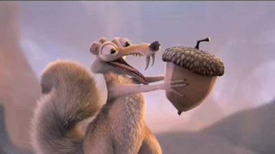
Then I asked these questions: How does he get from this pose to that pose? What shape does his body make on that breakdown? My animation supervisor, Nick Bruno, is a huge advocate of studying before beginning a shot and it will definitely make a difference in your work. Cartoony animation didn’t come naturally for me; I really had to watch and learn from a lot of the animations of my co-workers. How can Scrat get all the way across the screen in three frames and yet still seem believable?! Cartoony animation is all about simplicity. Thinking in terms of the simple shapes the character takes in their posing and how to transition between those poses in the most clear yet entertaining way. Think in terms of what needs to move, versus what needs to be still at any given moment. It’s amazing how much you can learn by going frame-by-frame through a shot.
Super cartoony is stuff is fun and cool in its own right, but it has to be based on a firm understanding of real-world physics. If I see someone’s reel that has a Tex Avery-like test, that’s great. More than likely though it’s going to be a copy of a gag/pose/take they’ve seen, which also means loads of professionals have seen it too. Having ONE test like that on your reel is fine, but if your ENTIRE reel is like that, then I start to think this animator either really loves cartoony stuff OR more likely they’re hiding the fact that they don’t understand real-world physics. Don’t be a one trick pony. Study from real life as well as the cartoony stuff and show people you can do both; that’s much more impressive. You can’t “cartoon” reality if you don’t know/understand what reality looks like.
The need for video reference is different for every animator. Some animators never use video reference and only draw thumbnails for their shots.
For me, I’m a big proponent of video reference. I like to “see” my shot before I even go into Maya. What I mean by that is I like having a firm plan ahead of time, being able to view the acting choices and poses as much ahead of time as possible. This lets me see the future difficulties, or lack thereof, and can anticipate where I’m going to need to spend most of my time.
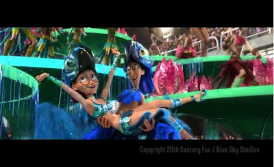
For example, I animated a shot in Rio of Linda during the Carnival sequence with her being held in the air by parade dancers, jumping down and dancing her way across a float. I did video reference of myself jumping down off of a table and starting to dance. What I didn’t anticipate is the awkward way in which my body needed to readjust balancing from such a jump in order to start doing some kind of dance move, not to mention the awkward twisting of my hips and shoulders. That was all seen in my reference.
From that point on I could plan accordingly, knowing I needed to be careful about my spline curves around that area and make sure I didn’t get any gimbal lock because of the extra twisting that would happen. Also knowing physically what my body had to do in order to achieve that movement, regaining balance in an awkward way, it made the overall performance more believable. That wouldn’t have happened if I didn’t get up and physically act it out. In order to help convey something believable for the viewer, you need to “feel it” yourself as best you can.
Years ago, I was self-conscious about doing things in front of the camera for reference, but the more I did it, the more comfortable I got. Especially seeing my fellow animators doing the same; it’s just something that takes a little getting used to. Jeff is just an awesome natural actor, hands down, and he always makes time to help out a co-worker who needs to do reference for their shot.

Sure thing! Whenever I’m given a shot to do, I start off just brainstorming ideas. I’ll try and find something that exists on dvd or the internet for inspiration and a point of reference. If it’s a cartoony shot, I’ll watch some cartoony animation; if it’s a dramatic dialogue I’ll find a movie with a similar tone and character that I’m animating and study that. I like to to know what already exists so that I am not copying a performance someone else may have already seen.
Sometimes I’ll doodle some thumbnails and make lots of notes to myself. How should the audience feel at this point? Where do I want them to be looking?

Once I am happy with the reference, I’ll open up Maya and start setting up my scene. I’m a big advocate of breaking things down and preparing my scene into easily manageable steps. For example, I like to lock off certain channels in my Channel Box that I know I won’t be keyframing. For example, if its a simple dialogue shot, I’ll lock off all the Scale attributes of my controls knowing I’m not going to be Scaling anything in this scene. There are so many controls on your characters sometimes that I try to eliminate needless keyframes from the beginning so that I don’t have more to clean up once I go from blocking to spline.
When my blocking is complete I would assign each body part (arms, legs, torso, head, etc) to a layer so that I can turn on/off the visibility of that part of the body. Before, when I was first learning how to animate, I would just hit “spline” on my animation curves, see this weightless/even-timed mess of an animation, get frustrated and not know where to start.

Secondly would your workflow constantly change for a scene? Would you always be trying to customize your workflow and willing to learn things from a different perspective?
Sure, things can change depending on the shot I’m given. If I have a Scrat shot, I usually don’t do video reference since there’s no way for me to move as fast as Scrat nor get as expressive of a pose, so I tend to rely on thumbnails more.
Or if I have an energetic chasing sequence in which one or more characters are running through the scene with a moving camera: those I tend to have in splined animation curves from the beginning. Working on a high energy scene with a moving camera, it’s much faster and clearer to having the characters moving in space with the camera from the beginning of the process.
 Step-keyed animation doesn’t look good with a moving camera. Even though the beginning phase of the process may change depending on the shot, the one thing that doesn’t change is my plan on tackling things one step at a time. I would still hide certain body parts and concentrate on those one at a time as I’m splining and polishing. At the same time, I love hearing about other animators workflows. Even though another animator may have a completely different workflow and approach, there is always something you can learn from another animator and adapt for your own process to become better/faster.
What’s been your biggest, most ridiculously geekiest moment you’ve had at work, and are you able to share the names of your associates with us?
One of the geekiest moments we had at the studio was when they invited Saul Bass of Rankin/Bass animations to come out and give a lecture. Fellow animator Pete Paquette was the moderator. All of us in the studio have grown up with his “Rudolph the Red Nosed Reindeer” and “Frosty the Snowman” animation specials. He got to share stories with us about how they got started in the business, made those animations, both stop-motion and hand drawn. Something I didn’t know was Saul Bass was also a co-creator/developer for the original Thundercats TV show. WHAT?! Now my nostalgic-geek-out level was at its max that day. He showed us a bunch of clips from other animation projects and development work that he’s currently working on. A wonderful experience meeting one of the creators of a childhood animation classic!
Finally, you have something on your monitor at Bluesky which keeps you motivated and I’d like you to share with us. What does it say?

Well great Garrett you’ve been fantastic this term so far, it’s been a pleasure!
Thank you!
Garrett’s IceAge3 Demo Reel:
http://www.garrettshikuma.com/Video/Garrett_Shikuma_IA3_Demo_Reel.mov
Garrett’s Rio Demo Reel:
http://vimeo.com/28590540
Garrett’s Web Page:
http://www.garrettshikuma.com/


